ion-item
アイテムは、テキスト、アイコン、アバター、画像、Input、その他のネイティブまたはカスタム要素を含むことができる要素です。アイテムは他のアイテムと一緒にリストの行としてのみ使用してください。アイテムはスワイプ、削除、並び替え、編集などができます。
基本的な使い方
アイテムはテキストを左寄せにし、テキストがアイテムより幅が広い場合は省略記号を追加しています。この動作は、Ionic Framework が提供す��る CSS Utilities を使って変更することができます。例えば、以下の例では .ion-text-nowrap を使っています。テキストを変換するためにアイテムに追加できる他のクラスについては、CSS Utilities Documentation を参照してください。
コンテンツの種類
リスト内のアイテムは様々な形をとりますが、一般的にビジュアル、テキスト、メタデータ、アクション、コントロールの5つの異なるコンテンツタイプをサポートします。しかし、これらのコンテンツタイプをすべて同時に使うべきではありません。以下のガイドでは、異なるコンテンツタイプと、アプリケーションでの適切な利用方法を示します。
補助ビジュアル
補助ビジュアル 補助ビジュアルはアイテムの装飾アイコンやその他の飾りです。サポーティングビジュアルの一般的な例は、アバター、 アイコン、サムネイルです。このコンテンツはアイテムの意図を理解するために必要ではないので、通常aria-hidden="true"を使ってスクリーンリーダーから隠されます。
アイコン・ボタンのように、アイテムとのインタラクションにビジュアルが必要な場合、そのビジュアルはサポート・ビジュアルではなく、 アクション となります。
Supporting visuals should be rendered in a consistent manner. This makes the information in each item easier to parse.
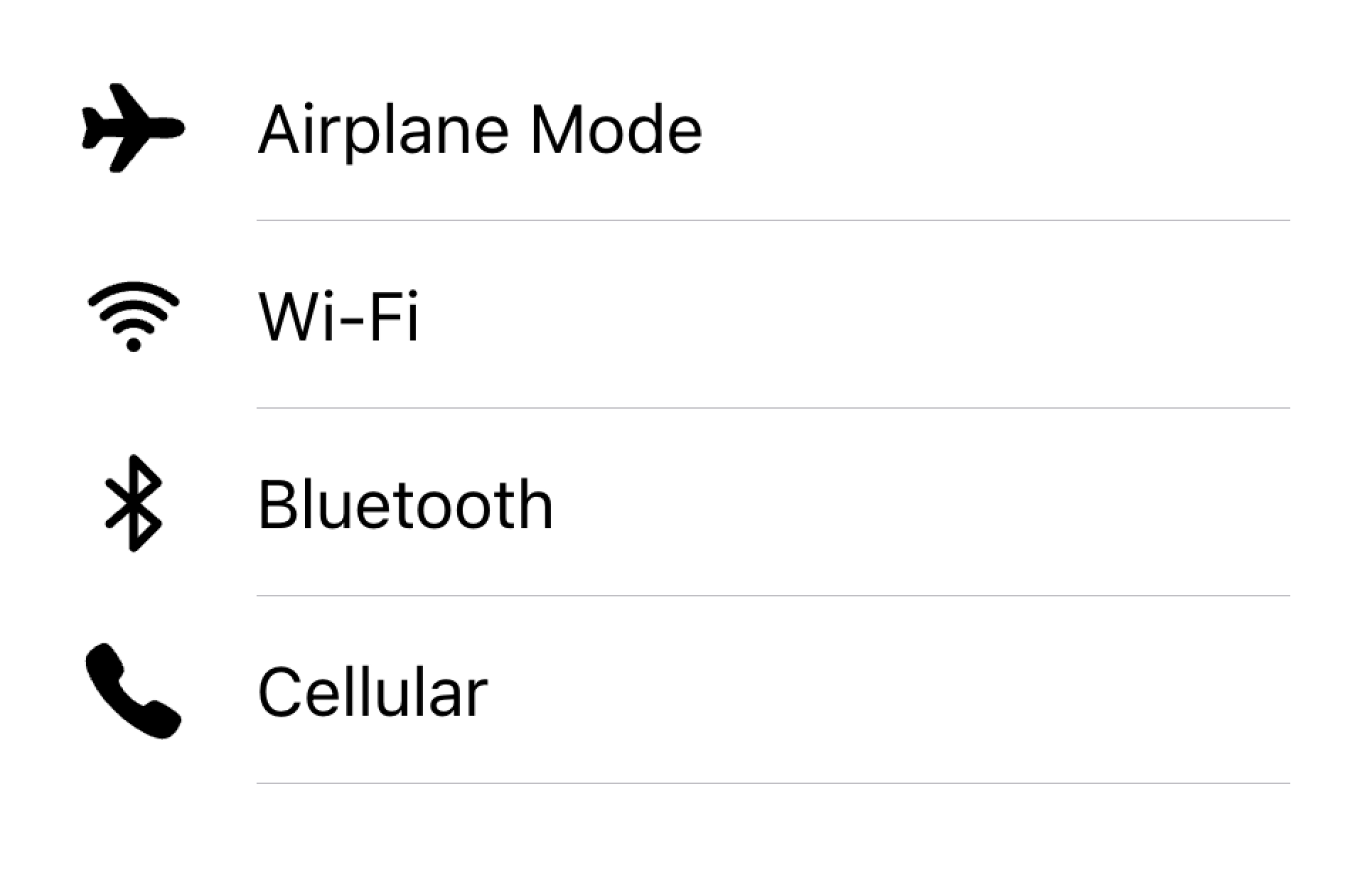
Align visuals on the same side in a list
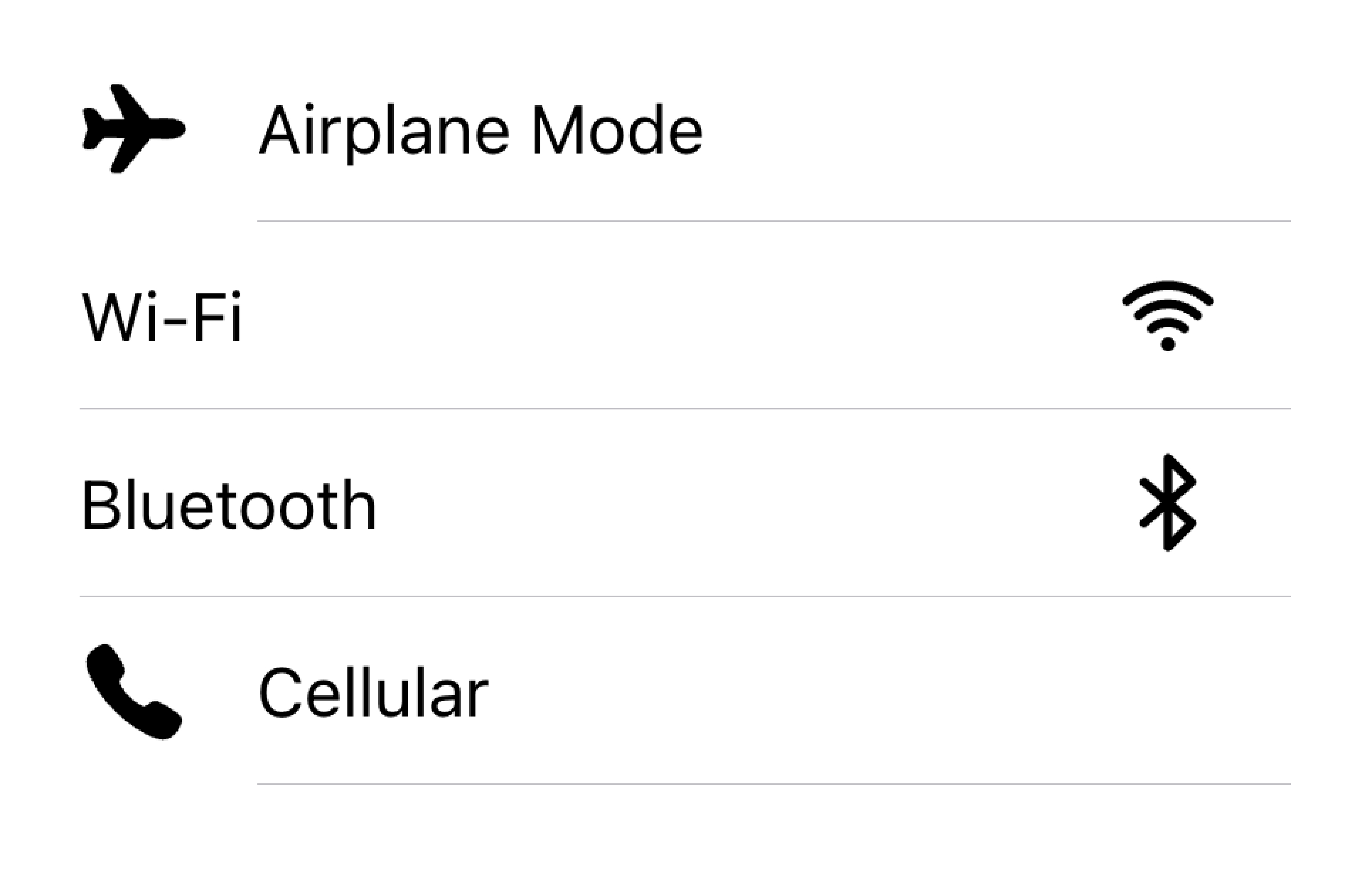
Don't render visuals with different alignments in the same list
下の例では、ビジュアルをサポートする2つのリストを作成しています。最初のリストはアイコンを使い、2番目のリストはアバターを使います。ビジュアルは装飾的なものなので、すべて aria-hidden="true" を指定しています。さらに、これらは start スロットで一貫して表示されます。
テキスト
テキスト・コンテンツ・タイプには、フォーム制御ラベルやその他の可視テキストが含まれます。このテキストは項目の意図を示す役割を果たします。テキストは短く、要点をまとめるようにしてください。
If you find that you need a few more sentences to clarify the item's purpose, consider moving the additional sentences to a Note at the bottom of the list. Adding the item to its own list makes it clear which item the text is associated with.
Move long text outside of the list
Don't try to fit long text in an item
下の例では、さまざまなタイプのテキストでリストを作成しています。"First Name"と "Last Name "のラベルは、テキスト入力に何を入力すべきかを示しています。
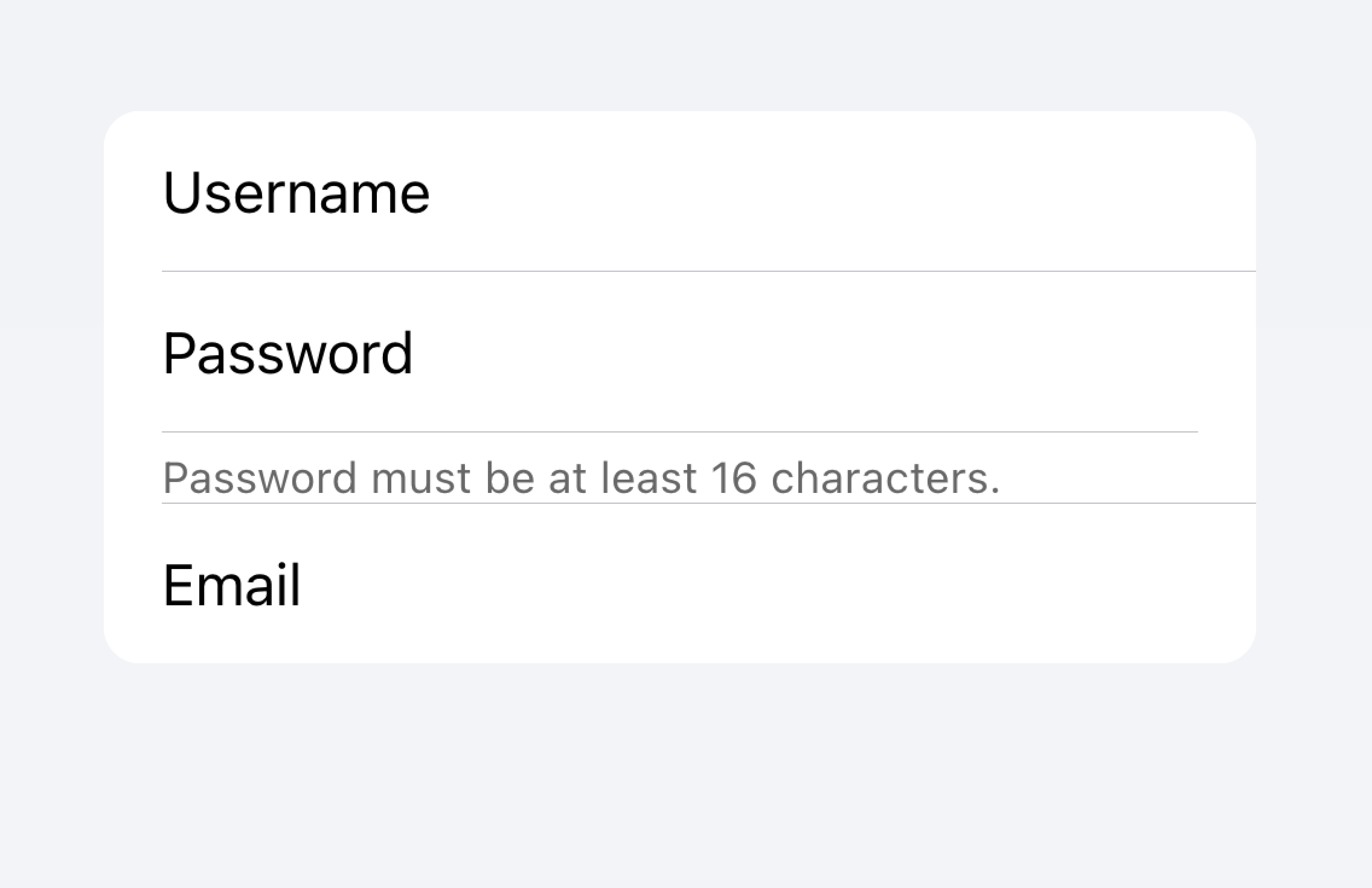
トグルの "Allow Notifications"ラベルの下には、ユーザーが通知を無効にできることを示すテキストが追加されています。このテキストは短いので、アイテムの内側に配置されています。
そのリストの下には、 Note の下に長いテキストを含むtextareaを含む別のリストがあります。textareaは、長いテキストが他のフィールドではなく、textareaに関連付けられていることを明らかにするために、それ自身のリストに配置されました。
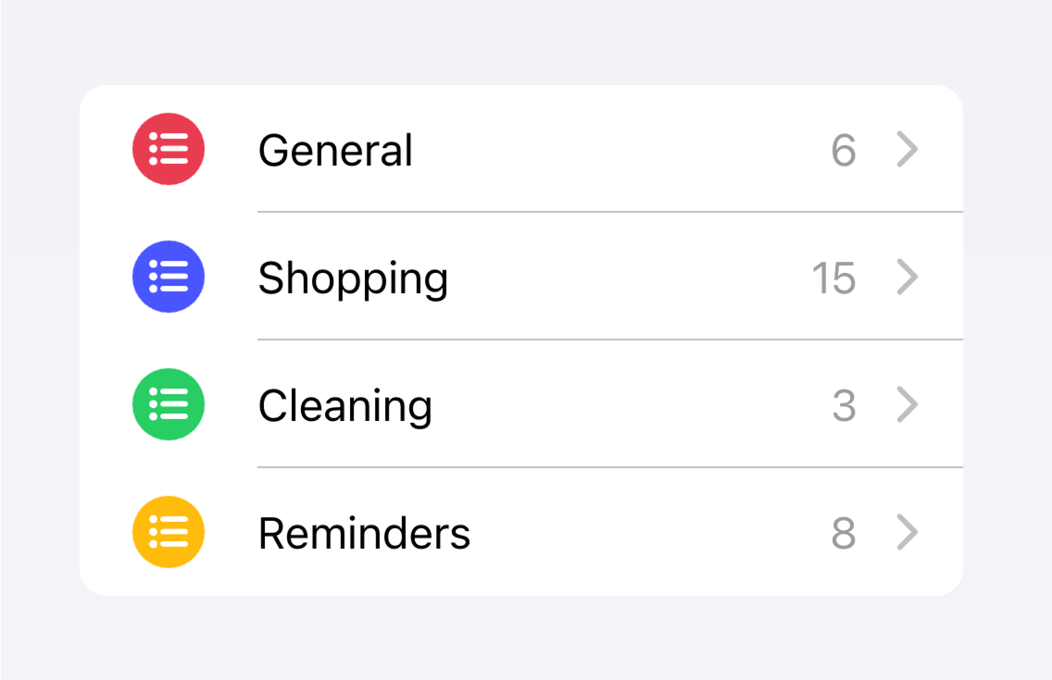
メタデータ
メタデータは、ステータステキストやカウントのようなアイテムの追加コンテキストを提供します。Badge](./badge)やNoteのようなコンポーネントは、メタデータを表示する素晴らしい方法です。
Limit the amount of metadata you include to only the most relevant information.
Add only the most important metadata
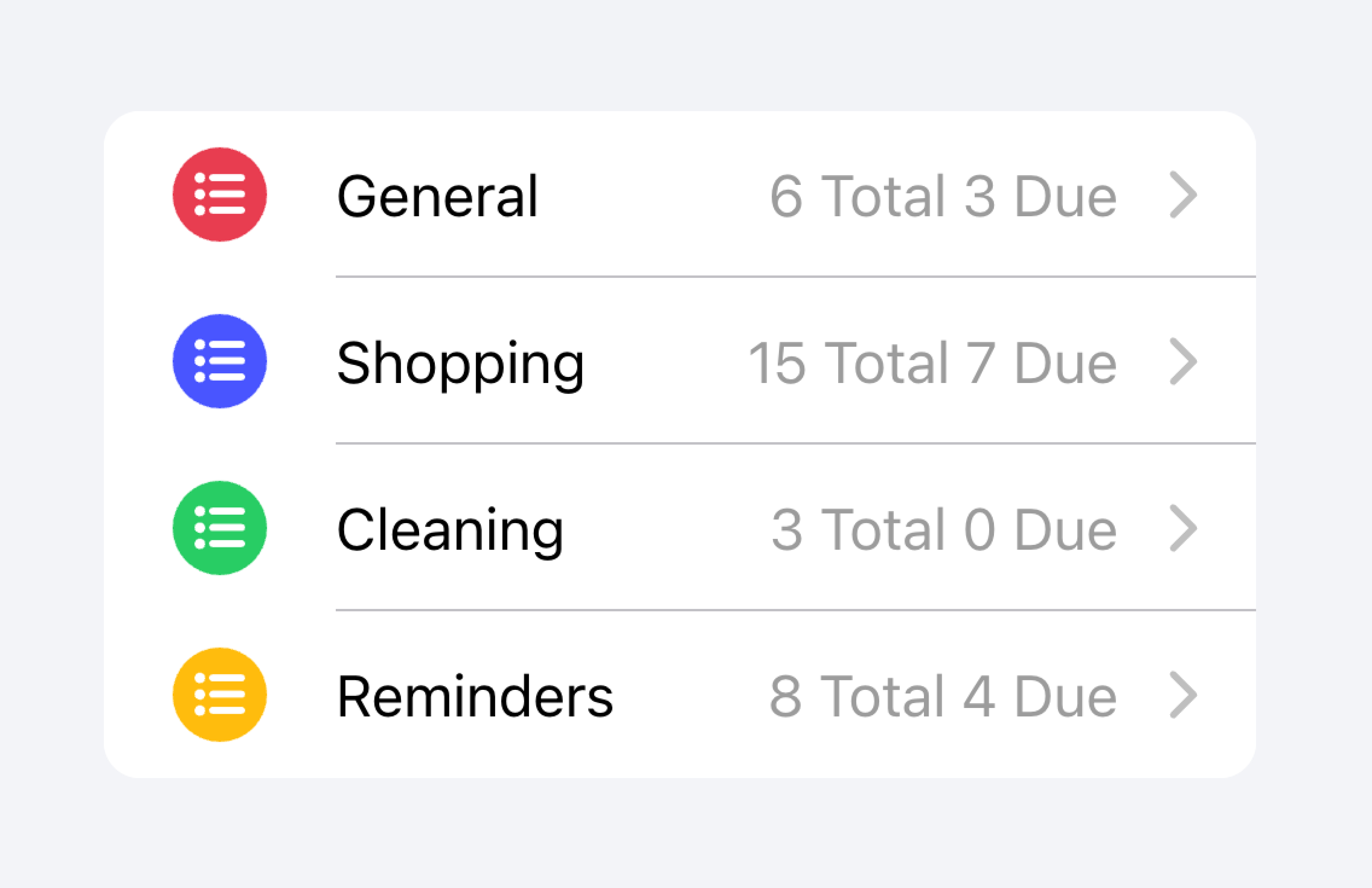
Don't add too much metadata as it can overwhelm or confuse the user.
Developers should also consider how important the metadata is. Drawing attention to the metadata may be helpful for the user or it may distract them from the more important information depending on the use case.
Prioritize the most important content.
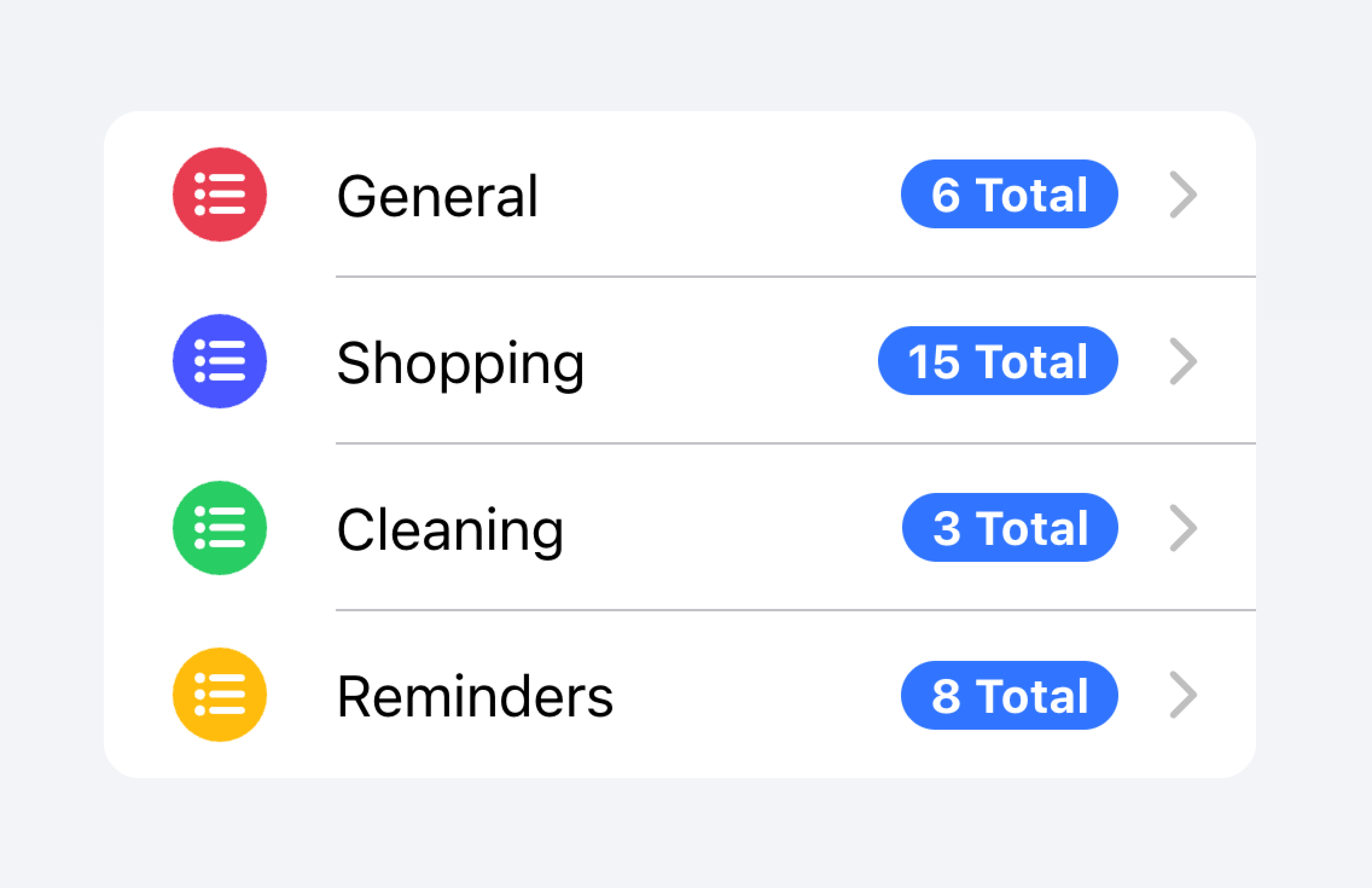
Prioritized metadata may distract from other important content.
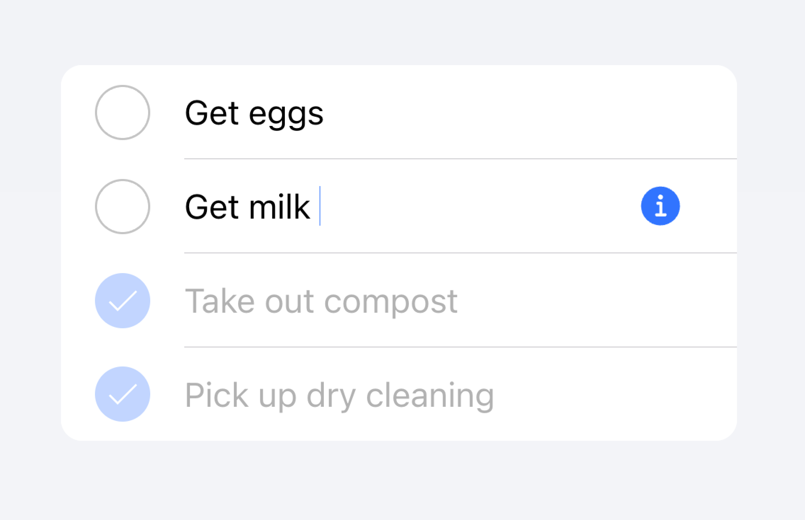
以下の例では、異なる種類のメタデータを持つ2つのリストを作成している。最初のリストはNoteを使って、それぞれのToDoリストにいくつのタスクがあるかを表示している。
つ目のリストは、iOSのメールアプリを真似て受信トレイを表示しています。このリストでは、"開始"スロットに "未読メッセージ"インジケータ、"終了"スロットにタイムスタンプとカスタム詳細アイコンを含むカスタムメタデータを使用しています。"未読メッセージ"インジケータは、未読メッセージにユーザーの注意を引くために青くハイライトされ、タイムスタンプはより控えめです。
アクション
アクションは、アクティブにすると何かをするインタラクティブな要素です。アイテムは1行に複数のアクションを表示することができます。しかし、開発者は、各アクションのタップターゲットが十分に大きいことを確認する必要があります。
開発者は、入れ子になったインタラクティブ機能を作成することは避けるべきです。例えば、 button プロパティが true に設定されている場合、開発者はアイテムのメインコンテンツ内にボタンを追加することを避けるべきです。
Actions can be added by using the Item Sliding component. Actions can also be placed directly inside of the Item without the use of Item Sliding, but this should be limited to no more than 2 actions.
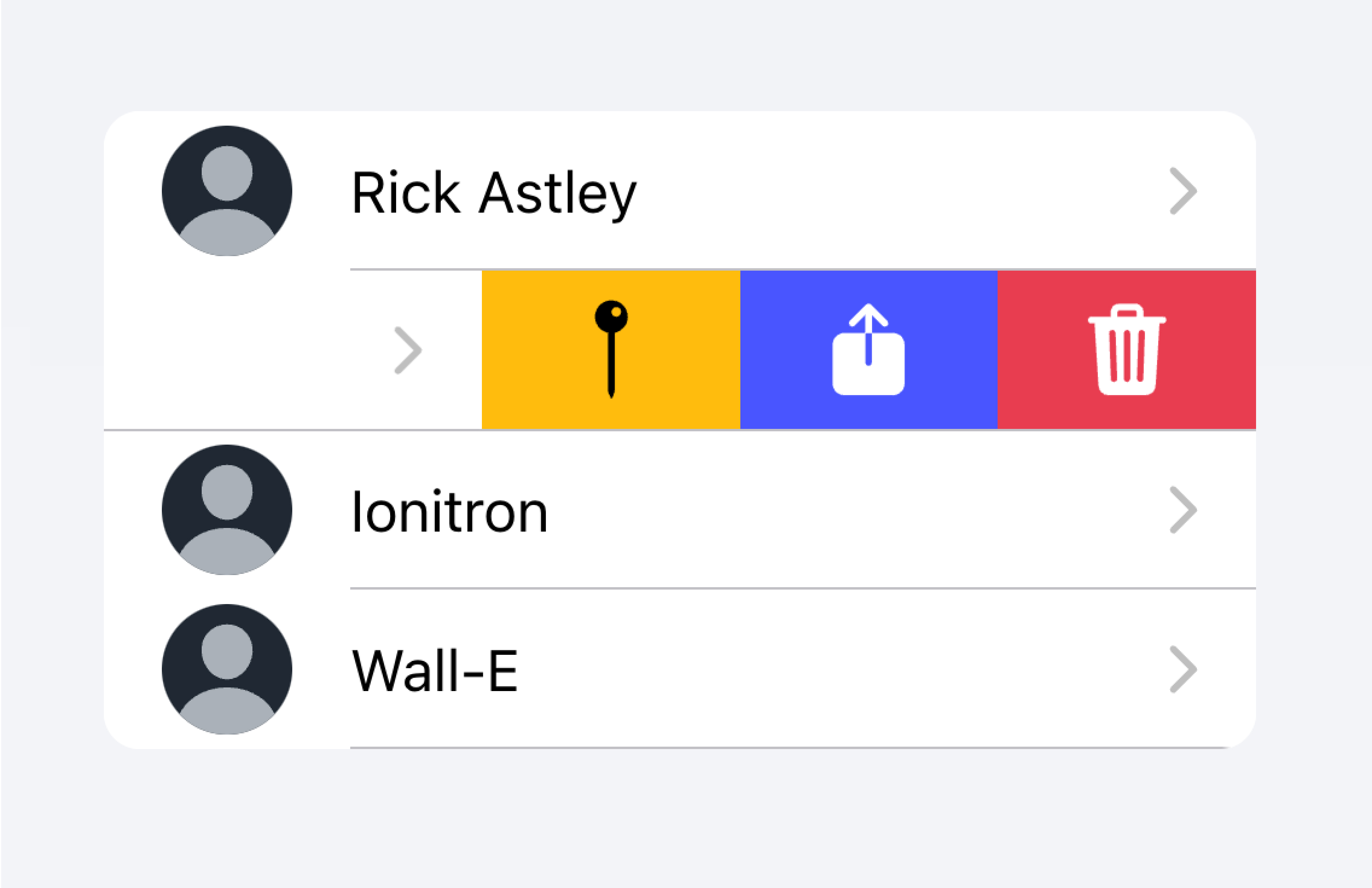
Use an Item Sliding to reveal multiple actions by swiping on the Item.
Don't put more than 2 actions within an Item.
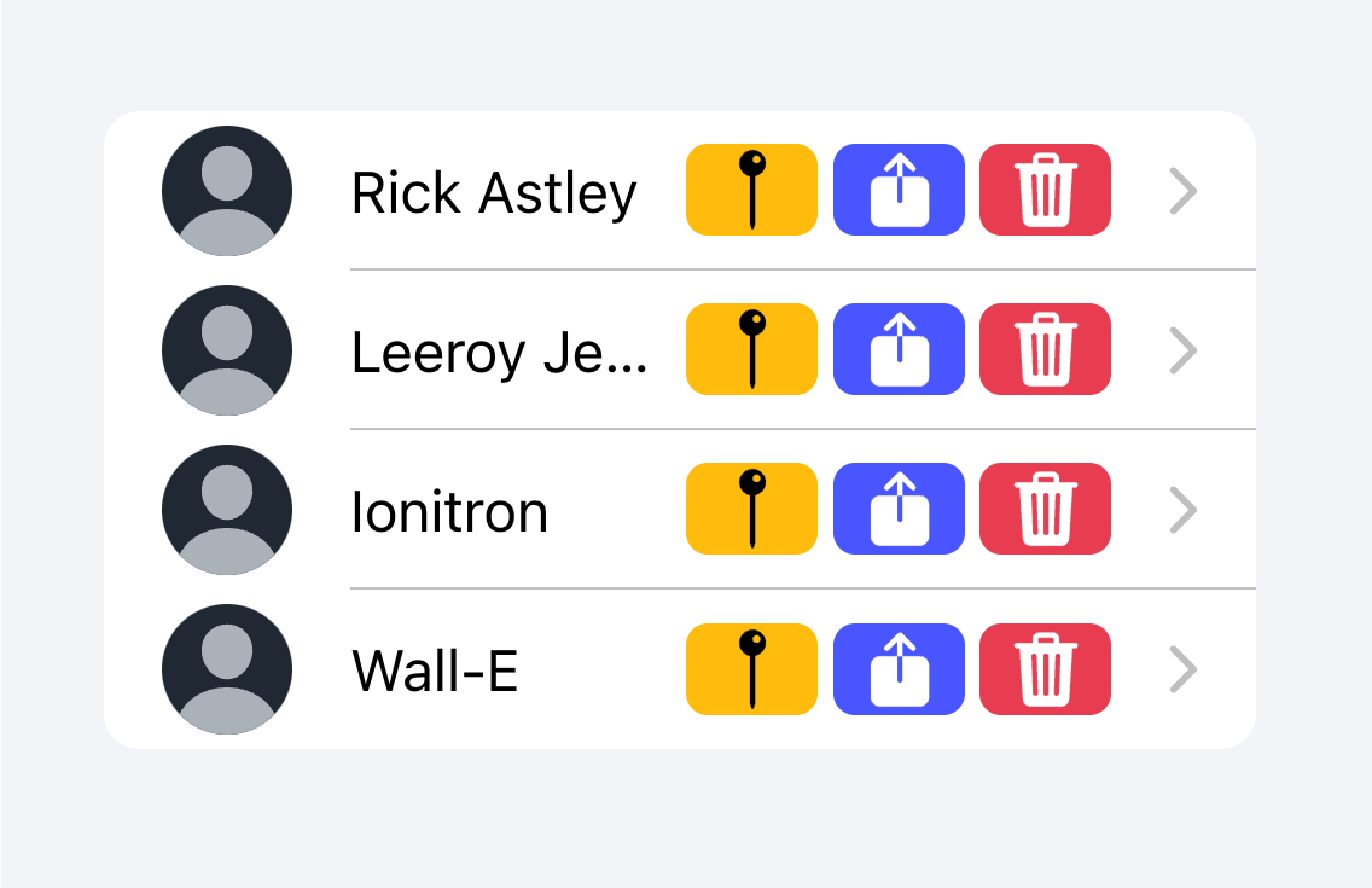
下の例では、連絡先のリストを作成しています。各項目は、その項目の完全な連絡先ページに移動するためのスタブボタンです。各項目には、ユーザーが項目をスワイプすることで表示できる追加アクションがあります。
コントロール
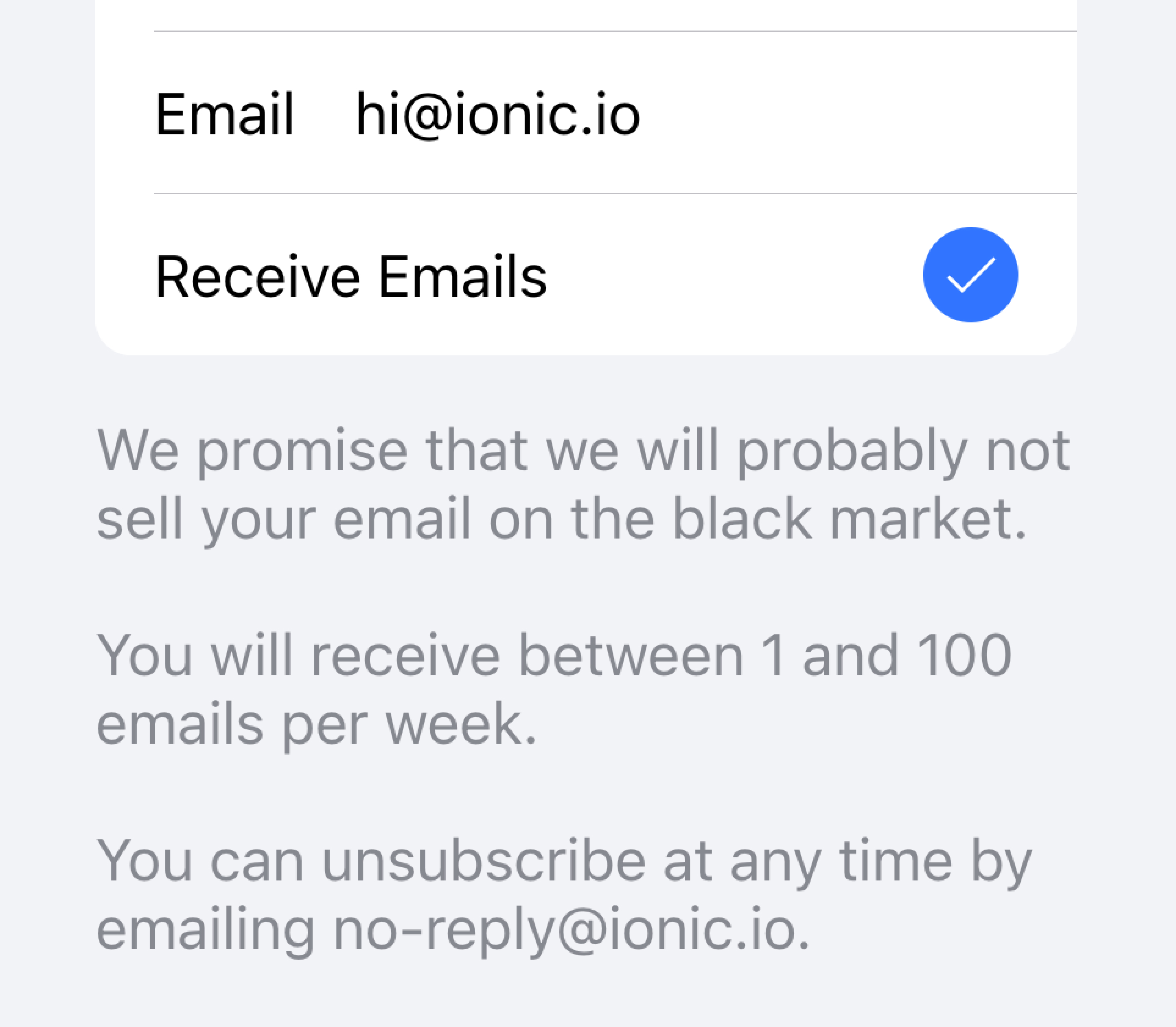
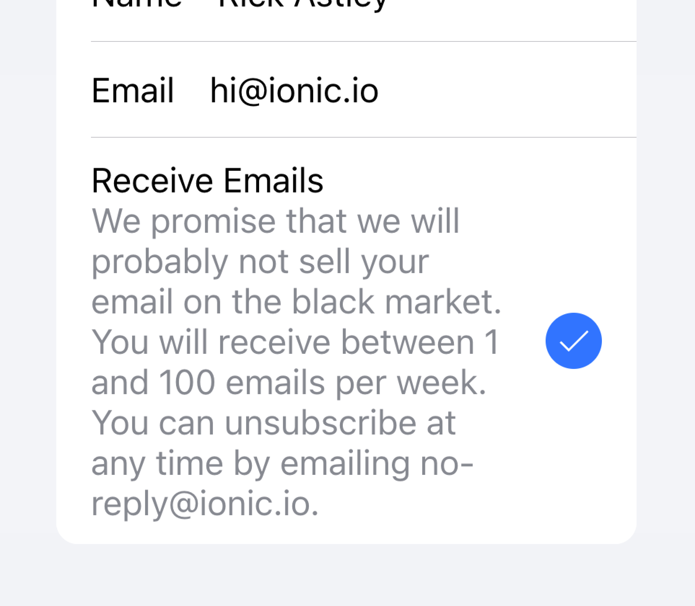
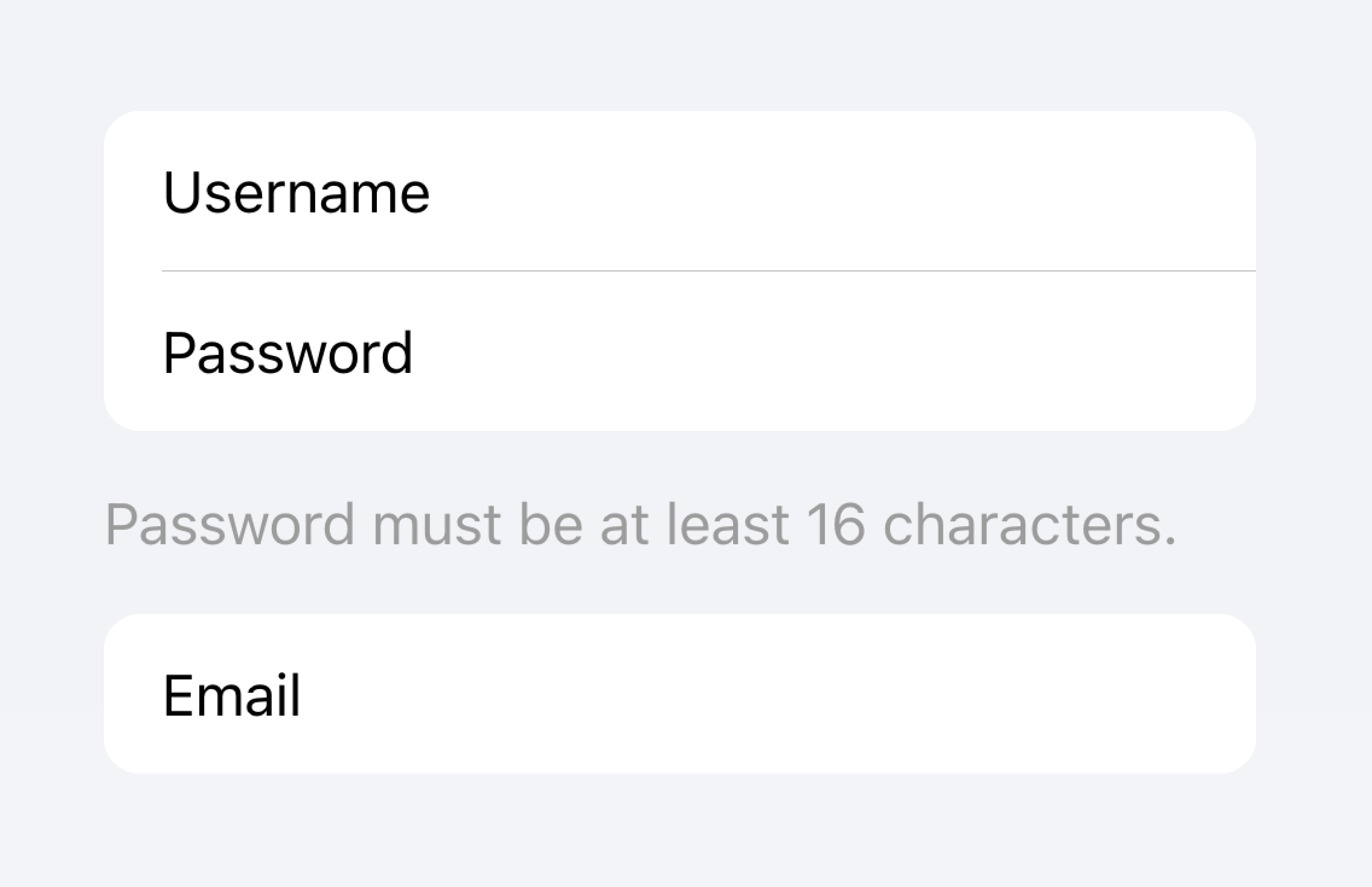
コントロールは、チェックボックス、入力、ラジオなどのフォームコンポーネントです。リスト内の各項目は、画面スペースの制約上、最大でも2つのコントロールを持つ必要があります。
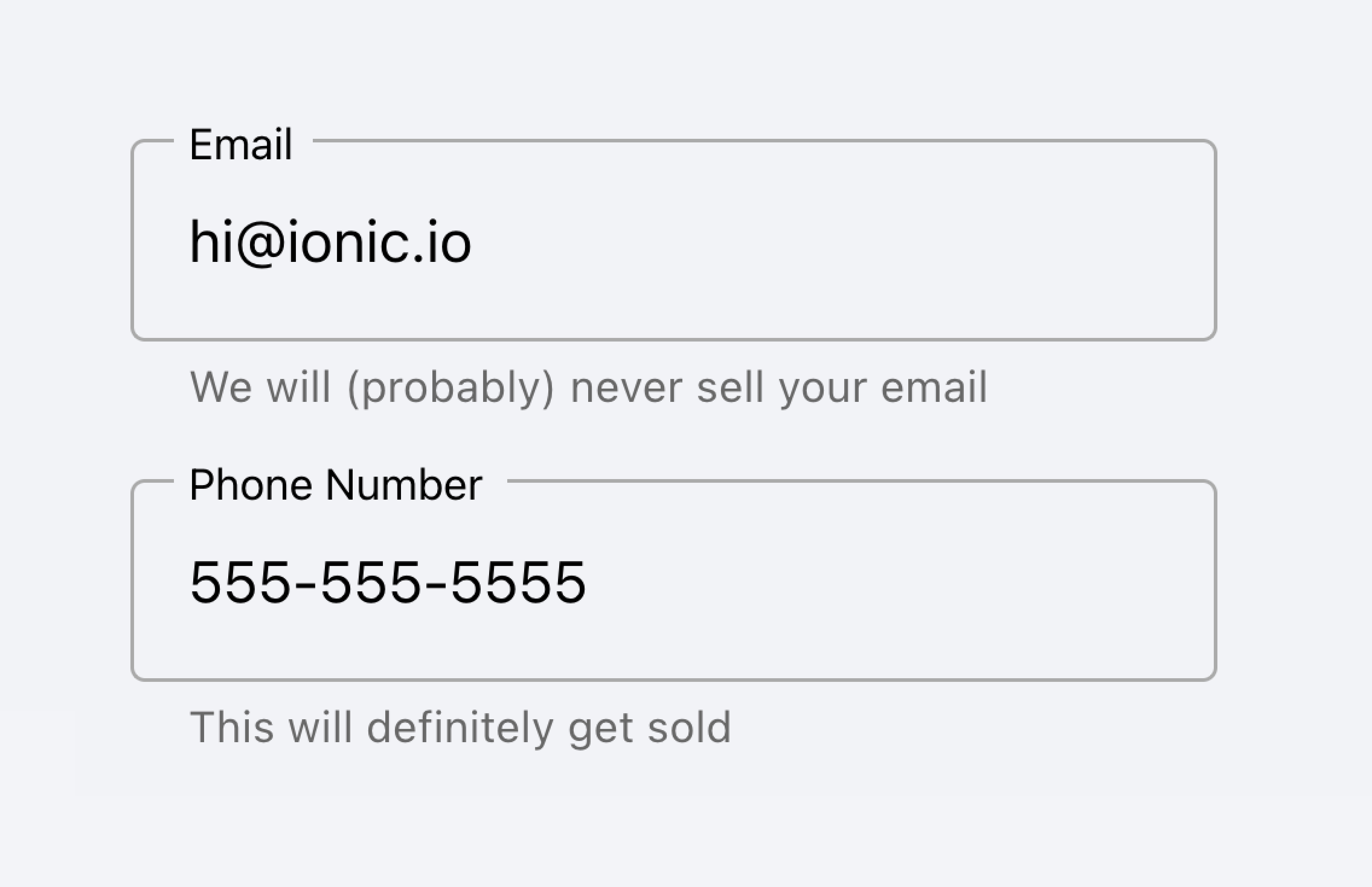
Metadata such as helper text or character counts should not be used on form controls in list views. If such metadata is needed, the form control should be placed outside of a list. Filled Inputs are a great way of visually defining the input container outside of a list.
Place inputs with metadata outside of the list.
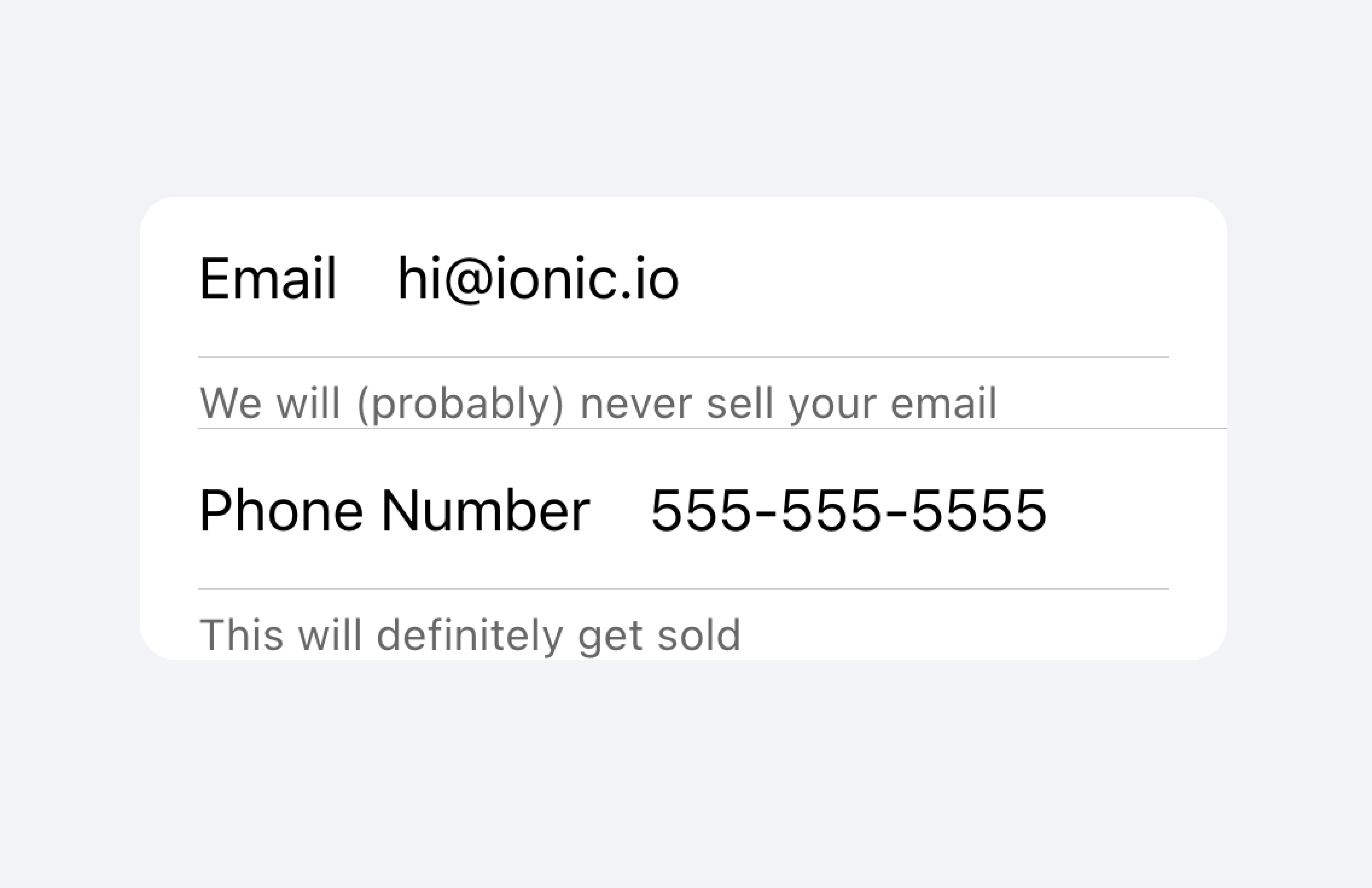
Don't put metadata for inputs in the list.
Alternatively, the metadata can be placed in a Note at the bottom of the list.
Place metadata for inputs at the end of a list.
Don't put metadata for inputs in the list.
Items should typically have no more than two controls. If you need more controls, consider adding the additional controls in a Modal that is accessible from the item.
Move additional controls to a submenu accessible from the item.
Don't use more than two controls within an item.
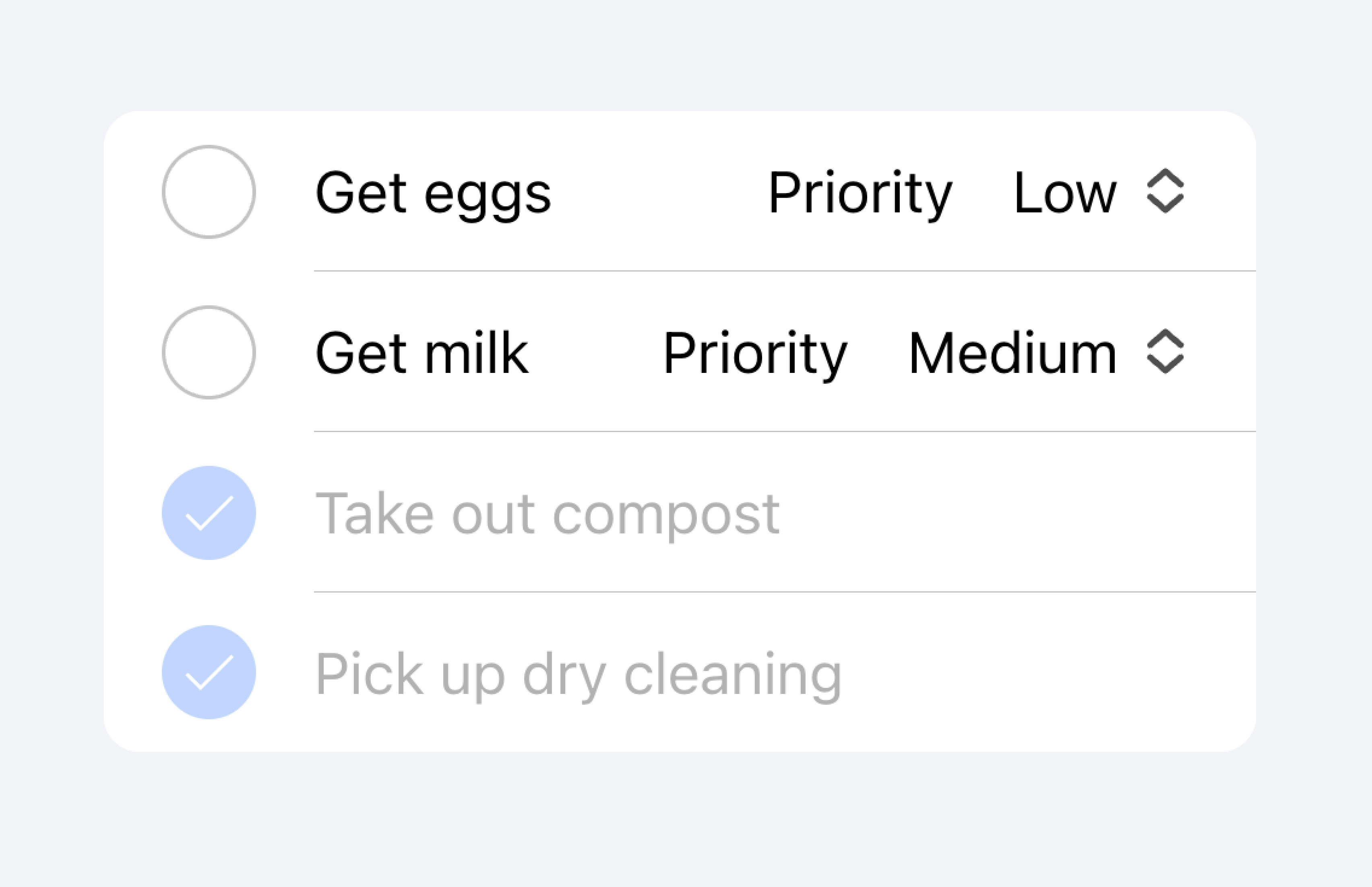
以下の例では、ToDoタスクのリストを作成しています。それぞれの項目にはチェックボックスと入力があります。チェックボックスはユーザーがタスクを完了としてマークできるようにし、入力はユーザーがタスクの名前を変更できるようにします。
クリック可能なItems
href か button プロパティが設定されている場合、itemは "clickable(クリック可能)" と見なされます。clickableなitemsには、インタラクティブに操作できることを示す視覚的な違いがいくつかあります。たとえば、clickableなitemは、md modeではrippleエフェクトを持ち、ios modeではハイライト表示され、ios modeでの detail arrow が表示されます。
Detail Arrows
デフォルトでは、clickableなitems は、ios modeで右矢印アイコンを表示します。clickableな要素の右矢印アイコンを非表示にするには、 detail プロパティを false に設定します。自動的に表示されない項目に右矢印アイコンを表示するには、detailプロパティを true に設定します。
Item Lines
アイテムはデフォルトで下部のボーダーを挿入して表示します。ボーダーは左側にパディングを持ち、 "start" スロットにスロットされたコンテンツの下に表示されることはありません。 lines プロパティを "full" または "none" に変更すると、それぞれ全幅のボーダーが表示され、ボーダーを表示しないようになります。
Buttons in Items
Buttonsは、アイテムの外側にあるときよりも、アイテムの内側にあるときの方が小さくスタイルされます。ボタンのサイズをアイテムの外側のボタンと同じにするには、size属性に"default"を設定します。
Item Inputs
テーマ
Colors
CSS Shadow Parts
CSSカスタムプロパティ
ガイドライン
以下のガイドラインは、リスト項目を理解しやすく、使いやすくするのに役立ちます。
- アイテムは Lists の中だけで使用してください。
- リスト内のアイテムは、一貫したフォーマットで表示されるべきです。例えば、アイテムに装飾的なアイコンを表示する場合、アイコンはアイテム間で同じように配置されるべきです。
- アイテムは決して入れ子になったインタラクティヴをレンダリングすべきではありません。入れ子になったインタラクティブ要素が使用されている場合、スクリーンリーダーは正しいインタラクティブ要素を選択することができません。例えば、
button="true"を持つion-itemの中にボタンを置くことは避けてください。 - コンテントタイプ](#content-types)を正しく使用してください。Itemコンポーネントは、List内の行として設計されており、汎用コンテナとして使用すべきではありません。
アクセシビリティ
キーボードインタラクション
An <ion-item> has the following keyboard interactions when any of these conditions are met:
- The
buttonproperty is set to"true", rendering a native<button>element. - The
hrefproperty is set, rendering a native<a>element. - The
routerLinkproperty is set, rendering a native<a>element.
| Key | Description |
|---|---|
| Tab | Moves focus to the next focusable element. |
| Shift + Tab | Moves focus to the previous focusable element. |
Button
When an <ion-item> renders a native <button> element, the keyboard interactions follow the same pattern as the button role:
| Key | Description |
|---|---|
| Enter | Activates the item, triggering its click event. If the item is within a form and has type set to "submit", it submits the form. |
| Space | Activates the item, triggering its click event. Does not submit the form, even if the item type is "submit". |
Anchor
When an <ion-item> renders a native <a> element, the keyboard interactions follow the same pattern as the link role:
| Key | Description |
|---|---|
| Enter | Activates the item, navigating to the linked page or moving focus to the in-page target. |
Properties
button
| Description | trueの場合、ボタンタグがレンダリングされ、アイテムはタップ可能になる。 |
| Attribute | button |
| Type | boolean |
| Default | false |
color
| Description | The color to use from your application's color palette. Default options are: "primary", "secondary", "tertiary", "success", "warning", "danger", "light", "medium", and "dark". For more information on colors, see theming. |
| Attribute | color |
| Type | "danger" | "dark" | "light" | "medium" | "primary" | "secondary" | "success" | "tertiary" | "warning" | string | undefined |
| Default | undefined |
detail
| Description | If true, a detail arrow will appear on the item. Defaults to false unless the mode is ios and an href or button property is present. |
| Attribute | detail |
| Type | boolean | undefined |
| Default | undefined |
detailIcon
| Description | detail が true に設定されているときに使用するアイコンです。 |
| Attribute | detail-icon |
| Type | string |
| Default | chevronForward |
disabled
| Description | trueの場合、ユーザはそのアイテムと対話することができません。 |
| Attribute | disabled |
| Type | boolean |
| Default | false |
download
| Description | This attribute instructs browsers to download a URL instead of navigating to it, so the user will be prompted to save it as a local file. If the attribute has a value, it is used as the pre-filled file name in the Save prompt (the user can still change the file name if they want). |
| Attribute | download |
| Type | string | undefined |
| Default | undefined |
href
| Description | Contains a URL or a URL fragment that the hyperlink points to. If this property is set, an anchor tag will be rendered. |
| Attribute | href |
| Type | string | undefined |
| Default | undefined |
lines
| Description | アイテムに表示される下枠の表示方法。 |
| Attribute | lines |
| Type | "full" | "inset" | "none" | undefined |
| Default | undefined |
mode
| Description | modeは、どのプラットフォームのスタイルを使用するかを決定します。 |
| Attribute | mode |
| Type | "ios" | "md" |
| Default | undefined |
rel
| Description | Specifies the relationship of the target object to the link object. The value is a space-separated list of link types. |
| Attribute | rel |
| Type | string | undefined |
| Default | undefined |
routerAnimation
| Description | When using a router, it specifies the transition animation when navigating to another page using href. |
| Attribute | router-animation |
| Type | ((baseEl: any, opts?: any) => Animation) | undefined |
| Default | undefined |
routerDirection
| Description | When using a router, it specifies the transition direction when navigating to another page using href. |
| Attribute | router-direction |
| Type | "back" | "forward" | "root" |
| Default | 'forward' |
target
| Description | Specifies where to display the linked URL. Only applies when an href is provided. Special keywords: "_blank", "_self", "_parent", "_top". |
| Attribute | target |
| Type | string | undefined |
| Default | undefined |
type
| Description | ボタンの種類。onclickまたはbutton`プロパティが存在する場合にのみ使用される。 |
| Attribute | type |
| Type | "button" | "reset" | "submit" |
| Default | 'button' |
イベント
No events available for this component.
メソッド
No public methods available for this component.
CSS Shadow Parts
| Name | Description |
|---|---|
detail-icon | アイテムのシェブロンアイコンを表示します。detail="true"`のときのみ適用されます。 |
native | すべての子要素をラップするネイティブHTMLのボタン、アンカー、またはdiv要素です。 |
CSSカスタムプロパティ
- iOS
- MD
| Name | Description |
|---|---|
--background | アイテムの背景 |
--background-activated | 押されたときのアイテムの背景。注意:これを設定すると、Material Designの波紋に干渉します。 |
--background-activated-opacity | 押されたときのアイテム背景の不透明度 |
--background-focused | タブキーでフォーカスしたときのアイテムの背景 |
--background-focused-opacity | タブキーでフォーカスしたときのアイテムの背景の不透明度 |
--background-hover | ホバー時のアイテムの背景 |
--background-hover-opacity | ホバー時のアイテムの背景の不透明度 |
--border-color | アイテムの縁取りの色 |
--border-radius | アイテムの境界線の半径 |
--border-style | アイテムの枠のスタイル |
--border-width | アイテムの枠の幅 |
--color | アイテムのカラー |
--color-activated | 押したときのアイテムの色 |
--color-focused | タブキーでフォーカスしたときのアイテムの色 |
--color-hover | ホバー時のアイテムの色 |
--detail-icon-color | アイテム詳細アイコンの色 |
--detail-icon-font-size | アイテム詳細アイコンのFont Size |
--detail-icon-opacity | アイテム詳細アイコンの不透明度 |
--inner-border-width | アイテム内枠の幅 |
--inner-box-shadow | アイテム内側のボックスシャドウ |
--inner-padding-bottom | アイテム内側のBottom Padding |
--inner-padding-end | 方向が左から右の場合はRight Padding、方向がアイテムの内側の右から左の場合はLeft Paddingとなります。 |
--inner-padding-start | 方向が左から右の場合はLeft Padding、方向が右から左の場合はRight Paddingがアイテム内側に入る |
--inner-padding-top | アイテム内側のTop Padding |
--min-height | アイテムの最小高さ |
--padding-bottom | アイテムのBottom Padding |
--padding-end | 方向が左から右の場合はRight Padding、方向が右から左の場合はLeft Paddingで項目を囲む |
--padding-start | 方向が左から右の場合はLeft Padding、方向が右から左の場合はRight Paddingで項目��を囲む |
--padding-top | アイテムのTop Padding |
--ripple-color | アイテム波及効果の色 |
--transition | アイテムの変遷 |
| Name | Description |
|---|---|
--background | アイテムの背景 |
--background-activated | 押されたときのアイテムの背景。注意:これを設定すると、Material Designの波紋に干渉します。 |
--background-activated-opacity | 押されたときのアイテム背景の不透明度 |
--background-focused | タブキーでフォーカスしたときのアイテムの背景 |
--background-focused-opacity | タブキーでフォーカスしたときのアイテムの背景の不透明度 |
--background-hover | ホバー時のアイテムの背景 |
--background-hover-opacity | ホバー時のアイテムの背景の不透明度 |
--border-color | アイテムの縁取りの色 |
--border-radius | アイテムの境界線の半径 |
--border-style | アイテムの枠のスタイル |
--border-width | アイテムの枠の幅 |
--color | アイテムのカラー |
--color-activated | 押したときのアイテムの色 |
--color-focused | タブキーでフォーカスしたときのアイテムの色 |
--color-hover | ホバー時のアイテムの色 |
--detail-icon-color | アイテム詳細アイコンの色 |
--detail-icon-font-size | アイテム詳細アイコンのFont Size |
--detail-icon-opacity | アイテム詳細アイコンの不透明度 |
--inner-border-width | アイテム内枠の幅 |
--inner-box-shadow | アイテム内側のボックスシャドウ |
--inner-padding-bottom | アイテム内側のBottom Padding |
--inner-padding-end | 方向が左から右の場合はRight Padding、方向がアイテムの内側の右から左の場合はLeft Paddingとなります。 |
--inner-padding-start | 方向が左から右の場合はLeft Padding、方向が右から左の場合はRight Paddingがアイテム内側に入る |
--inner-padding-top | アイテム内側のTop Padding |
--min-height | アイテムの最小高さ |
--padding-bottom | アイテムのBottom Padding |
--padding-end | 方向が左から右の場合はRight Padding、方向が右から左の場合はLeft Paddingで項目を囲む |
--padding-start | 方向が左から右の場合はLeft Padding、方向が右から左の場合はRight Paddingで項目を囲む |
--padding-top | アイテムのTop Padding |
--ripple-color | アイテム波及効果の色 |
--transition | アイテムの変遷 |
Slots
| Name | Description |
|---|---|
| `` | slotがない状態で提供される場合、コンテンツは名前付きslotの間に配置されます。 |
end | コンテンツは、LTRではアイテムテキストの右側に、RTLでは左側に配置されます。 |
start | コンテンツは、LTRではアイテムテキストの左側に、RTLでは右側に配置されます。 |