ion-item
Items are elements that can contain text, icons, avatars, images, inputs, and any other native or custom elements. Items should only be used as rows in a List with other items. Items can be swiped, deleted, reordered, edited, and more.
Basic Usage
Items left align text and wrap when the text is wider than the item. We can modify this behavior using the CSS Utilities provided by Ionic Framework, such as using .ion-text-nowrap in the below example. See the CSS Utilities Documentation for more classes that can be added to an item to transform the text.
Content Types
While items in a list take many forms, they typically support 5 different content types: supporting visuals, text, metadata, actions, and controls. However, not all of these content types should be used together at the same time. The following guide shows the different content types as well as how to properly utilize them in an application.
Supporting Visuals
Supporting visuals are decorative icons or other adornments for an item. Common examples of supporting visuals are Avatars, Icons, and Thumbnails. Since this content is not required to understand the intent of the item, it is typically hidden from screen readers using aria-hidden="true".
If a visual is required to interact with the item, such as an icon button, then the visual is an action not a supporting visual.
Supporting visuals should be rendered in a consistent manner. This makes the information in each item easier to parse.
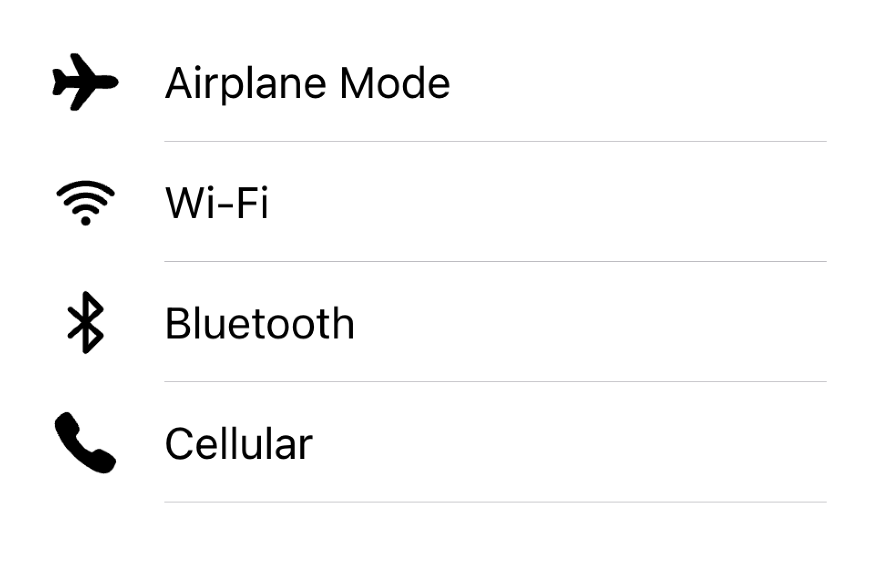
Align visuals on the same side in a list
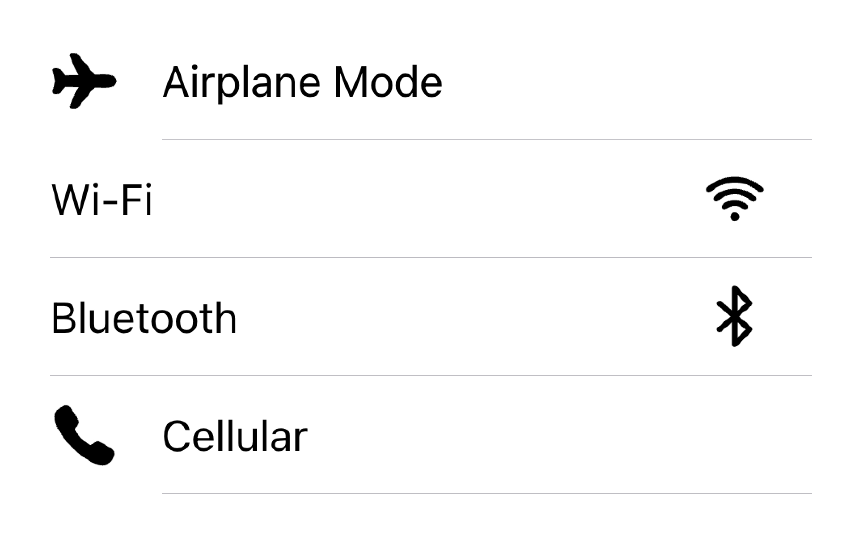
Don't render visuals with different alignments in the same list
In the example below, we are creating two lists with supporting visuals. The first list uses icons, and the second list uses avatars. The visuals are decorative, so they all have aria-hidden="true". Additionally, they are presented consistently in the start slot.
Text
The text content type includes form control labels or other visible text. This text serves to indicate the intent of the item. Try to keep the text short and to the point.
If you find that you need a few more sentences to clarify the item's purpose, consider moving the additional sentences to a Note at the bottom of the list. Adding the item to its own list makes it clear which item the text is associated with.
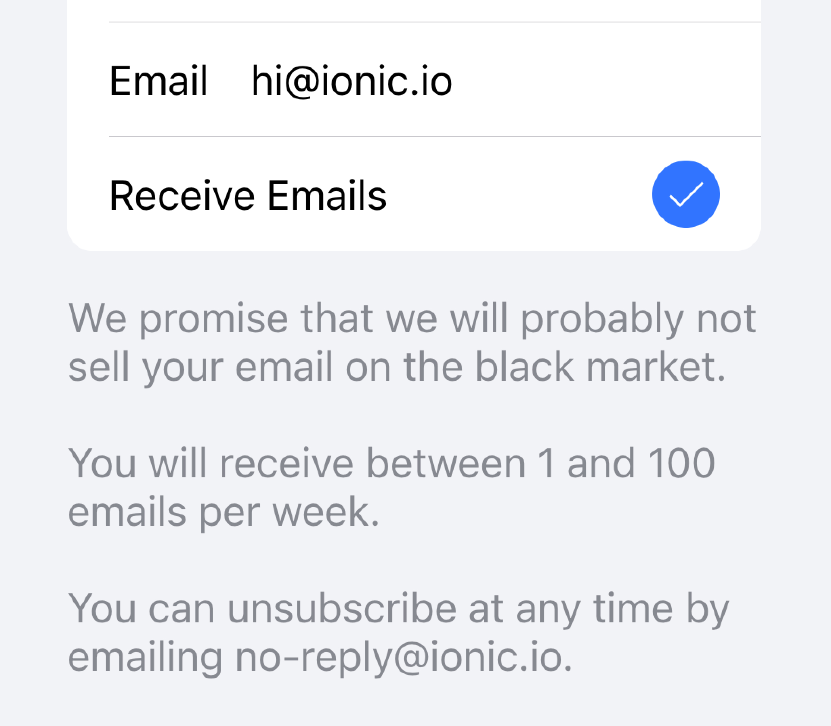
Move long text outside of the list
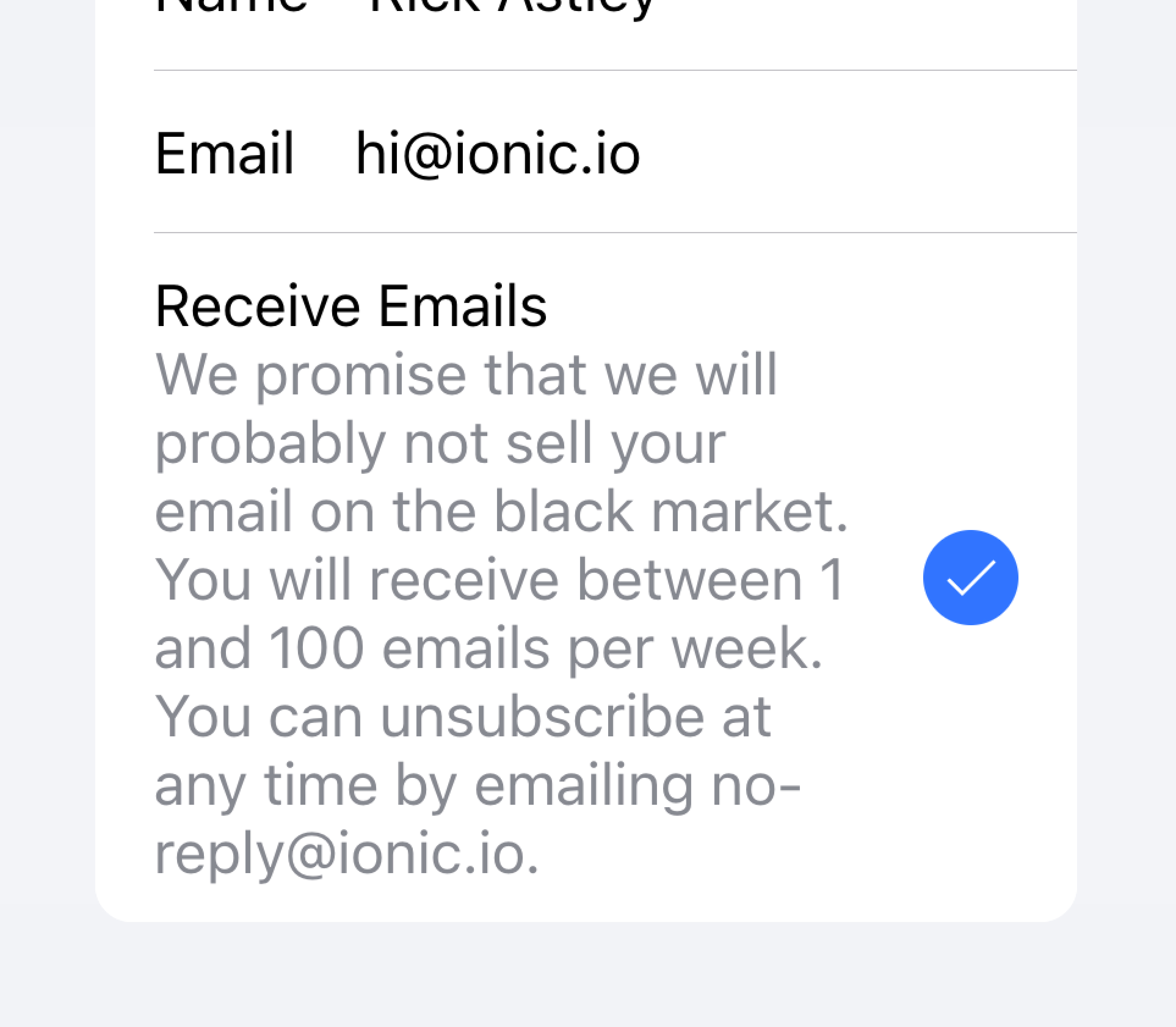
Don't try to fit long text in an item
In the example below, we are creating a list with different types of text. The "First Name" and "Last Name" labels serve to indicate what to type into the text inputs.
The "Allow Notifications" label on the toggle has additional text underneath it that notes users can disable notifications. Since this text is short, it is placed inside of the item.
Below that list is another list containing a textarea with a Note containing long text underneath. The textarea was placed in its own list to make it apparent that the long text is associated with the textarea and not any other fields.
Metadata
Metadata provides additional context for an item such as status text or counts. Components like Badge or Note are great ways of showing metadata.
Limit the amount of metadata you include to only the most relevant information.
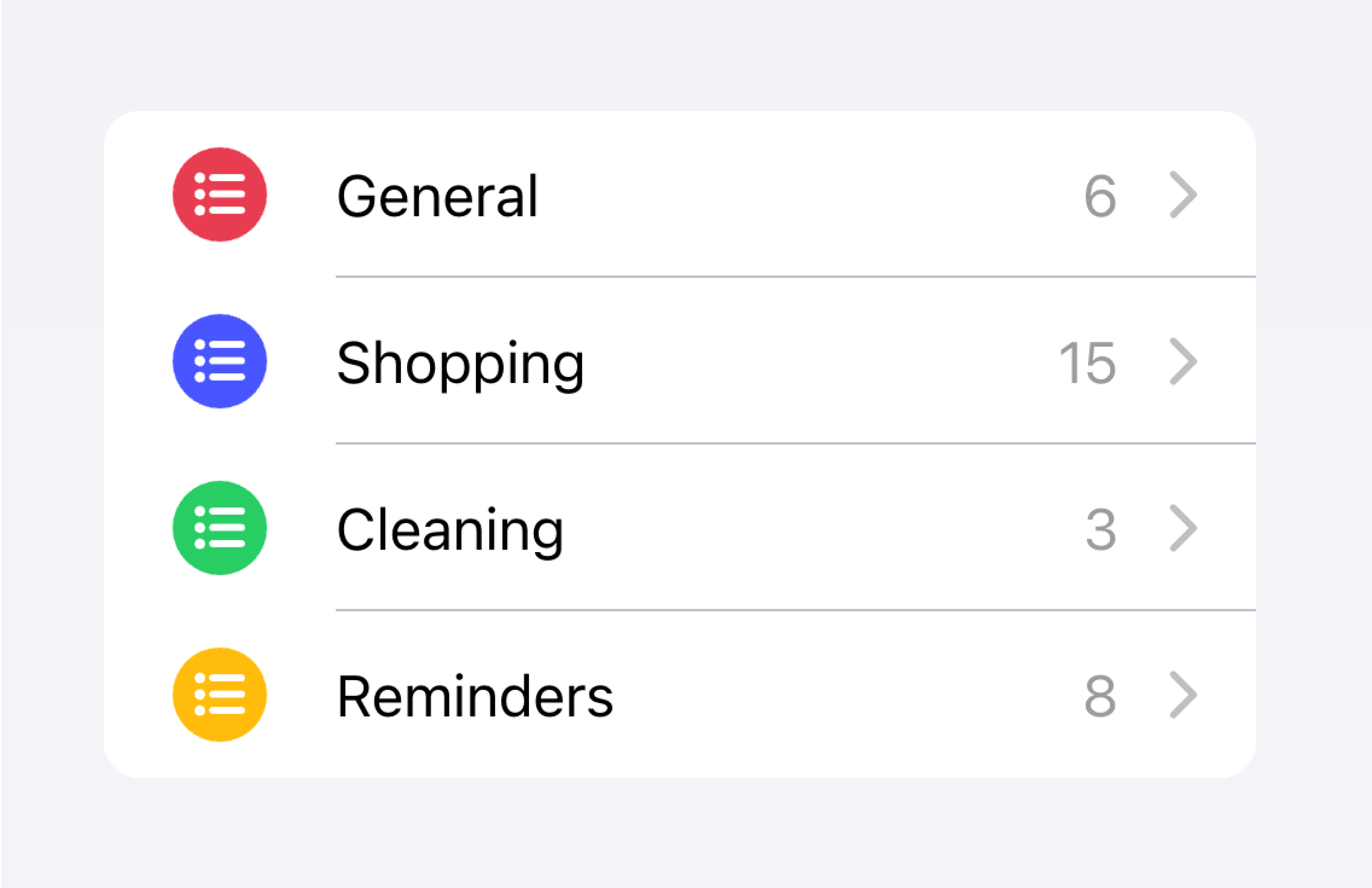
Add only the most important metadata
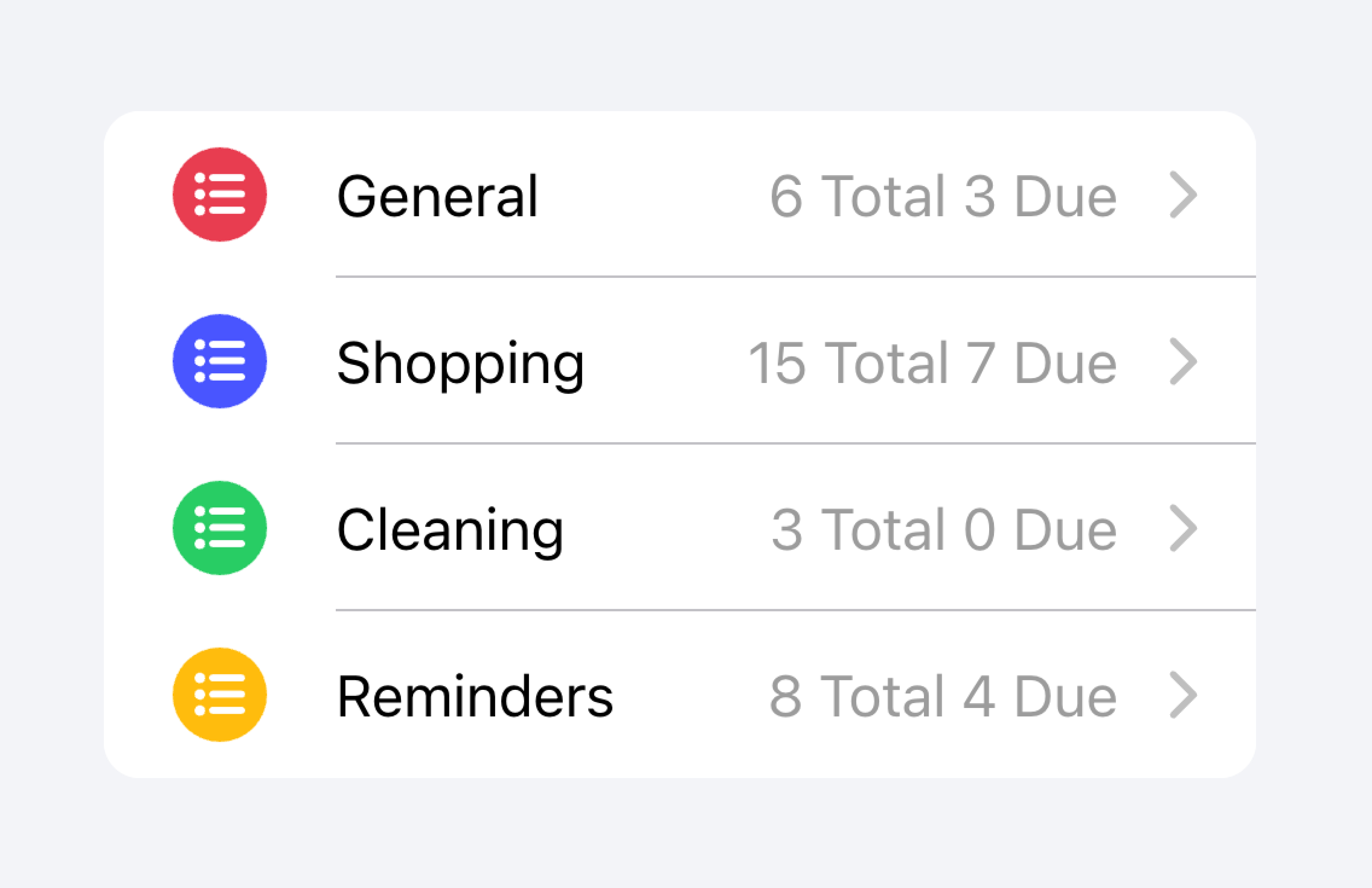
Don't add too much metadata as it can overwhelm or confuse the user.
Developers should also consider how important the metadata is. Drawing attention to the metadata may be helpful for the user or it may distract them from the more important information depending on the use case.

Prioritize the most important content.
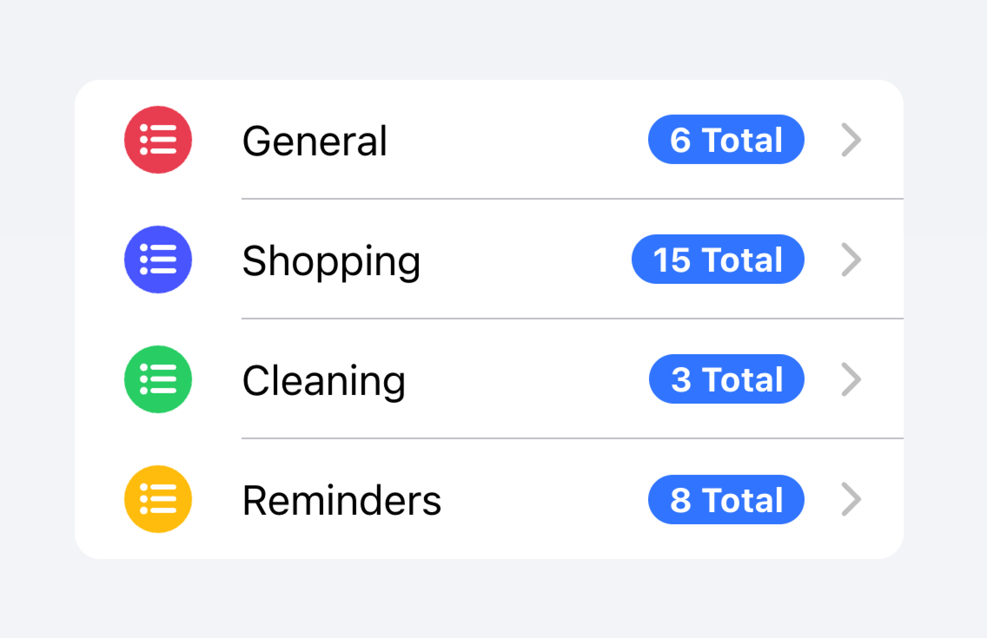
Prioritized metadata may distract from other important content.
In the example below, we are creating two lists with different kinds of metadata. The first list uses Note to show how many tasks are in each to-do list.
The second list mimics the iOS Mail app to show an inbox. This list makes use of custom metadata including an "unread message" indicator in the "start" slot as well as a timestamp and custom detail icon in the "end" slot. The "unread message" indicator is highlighted in blue to draw the user's attention to the unread messages, while the timestamp is more subtle.
Actions
Actions are interactive elements that do something when you activate them. An item can have multiple actions displayed on a line. However, developers should ensure that each action's tap target is large enough to be usable.
Developers should avoid creating nested interactives which can break the user experience with screen readers. For example, developers should avoid adding a button inside the main content of the Item if the button property is set to true.
Actions can be added by using the Item Sliding component. Actions can also be placed directly inside of the Item without the use of Item Sliding, but this should be limited to no more than 2 actions.
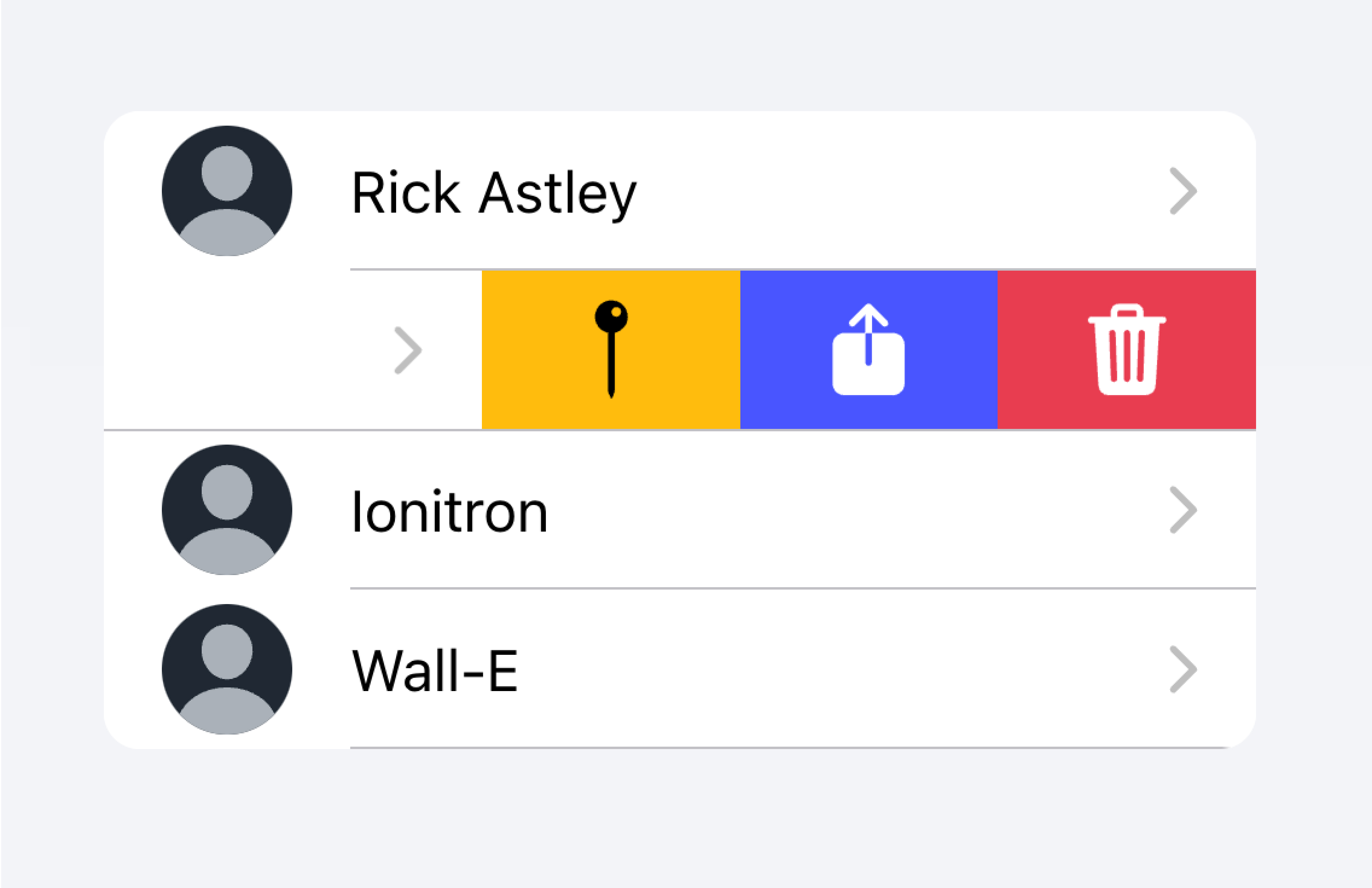
Use an Item Sliding to reveal multiple actions by swiping on the Item.
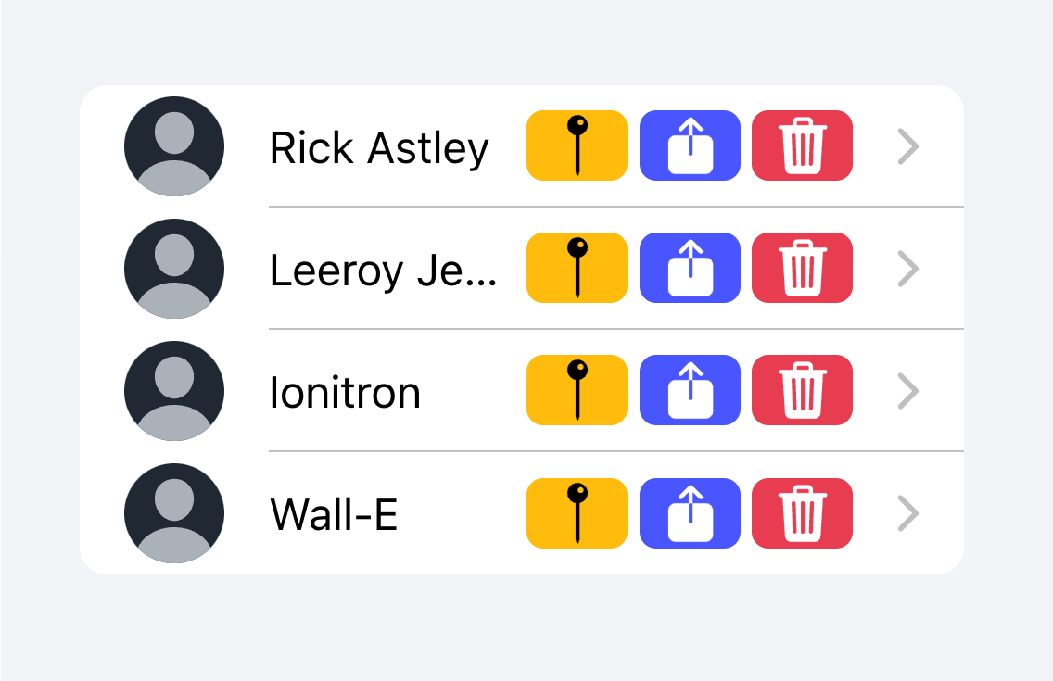
Don't put more than 2 actions within an Item.
In the example below, we are creating a list of contacts. Each item is a stubbed button intended to bring you to the full contact page for that item. There are additional actions associated with each item that users can reveal by swiping on the item.
Controls
Controls are form components such as checkboxes, inputs, radios, and more. Each item in a list should have at most two controls due to screen space constraints.
Metadata such as helper text or character counts should not be used on form controls in list views. If such metadata is needed, the form control should be placed outside of a list. Filled Inputs are a great way of visually defining the input container outside of a list.
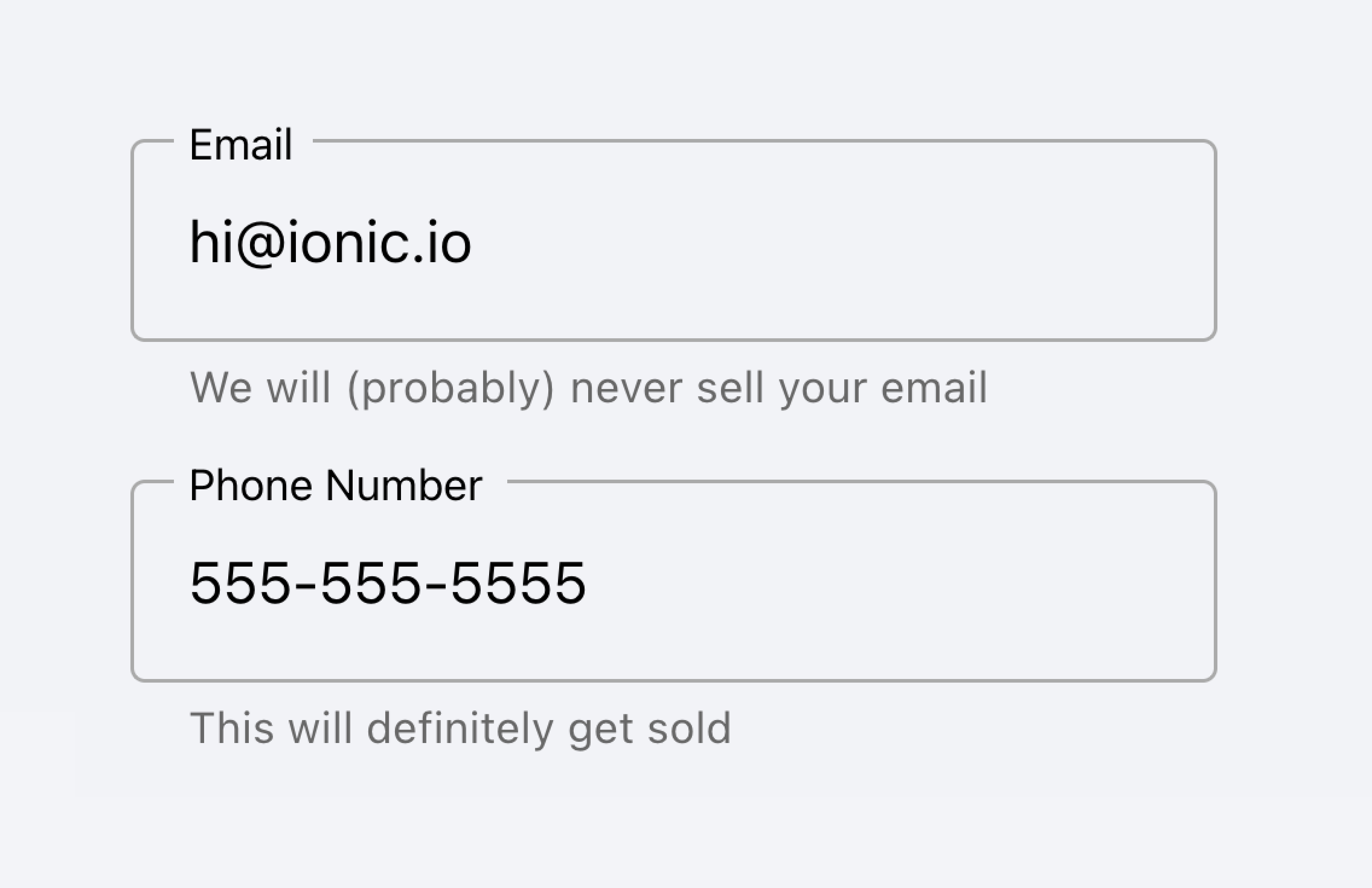
Place inputs with metadata outside of the list.
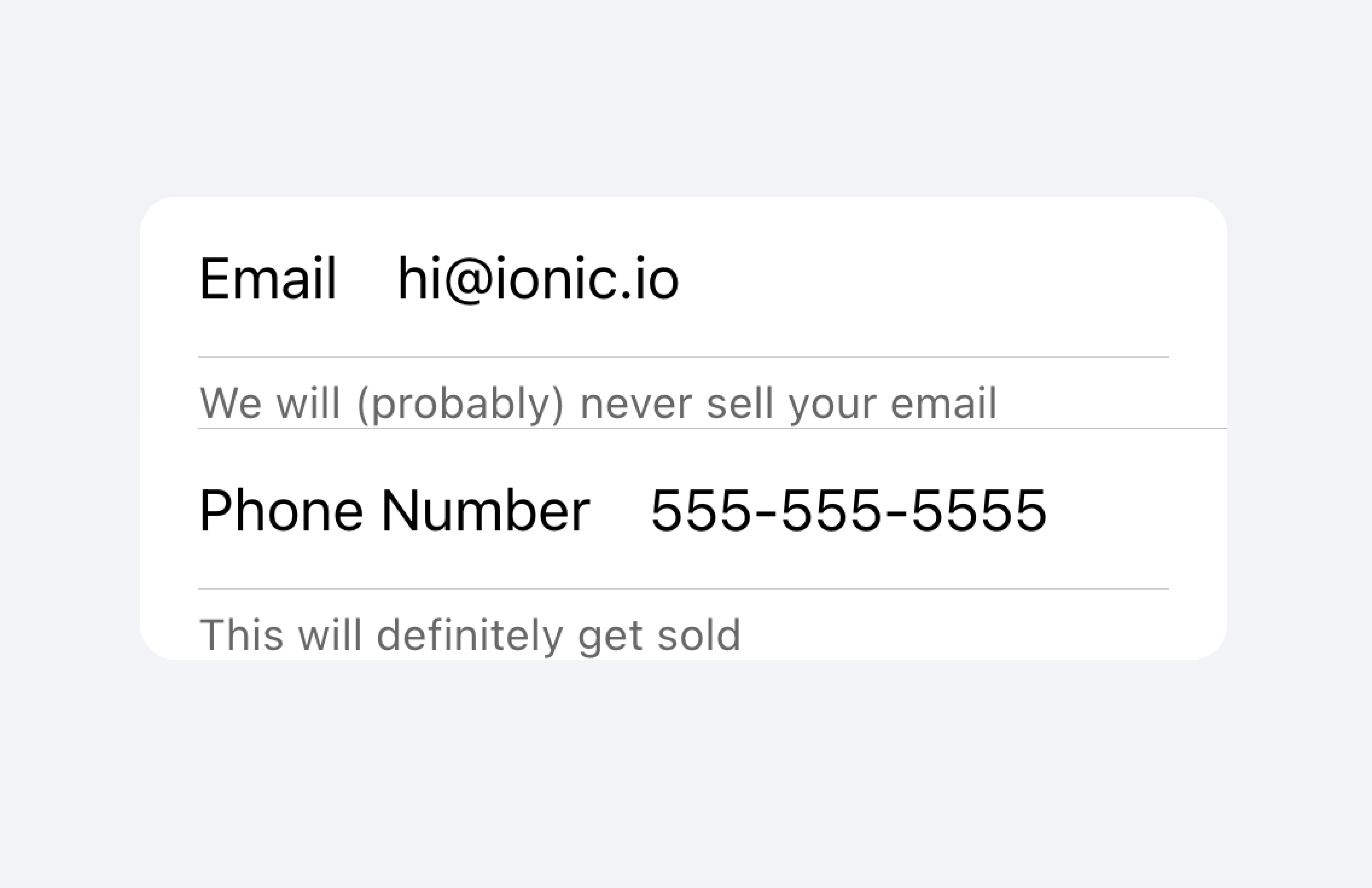
Don't put metadata for inputs in the list.
Alternatively, the metadata can be placed in a Note at the bottom of the list.
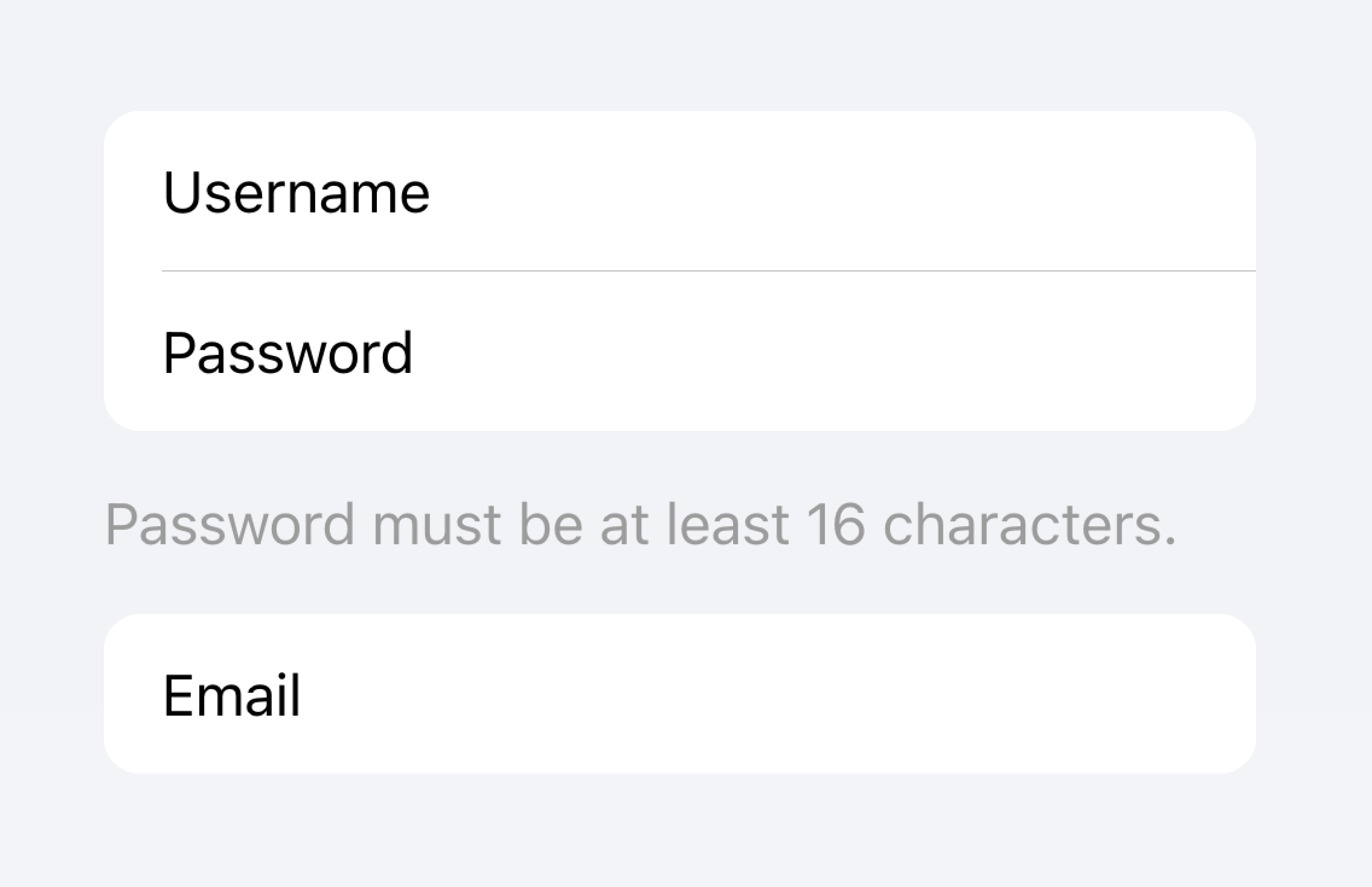
Place metadata for inputs at the end of a list.
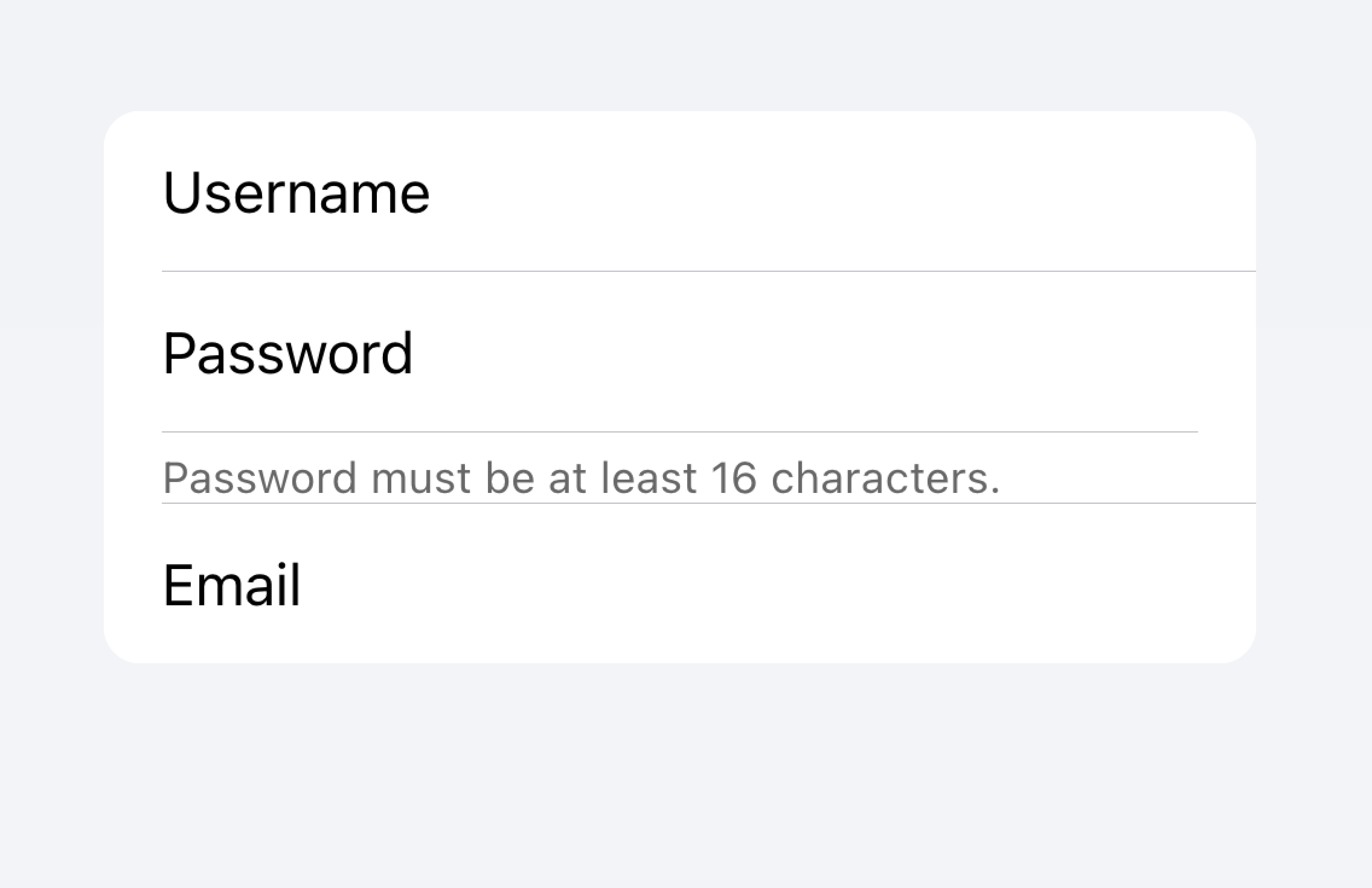
Don't put metadata for inputs in the list.
Items should typically have no more than two controls. If you need more controls, consider adding the additional controls in a Modal that is accessible from the item.
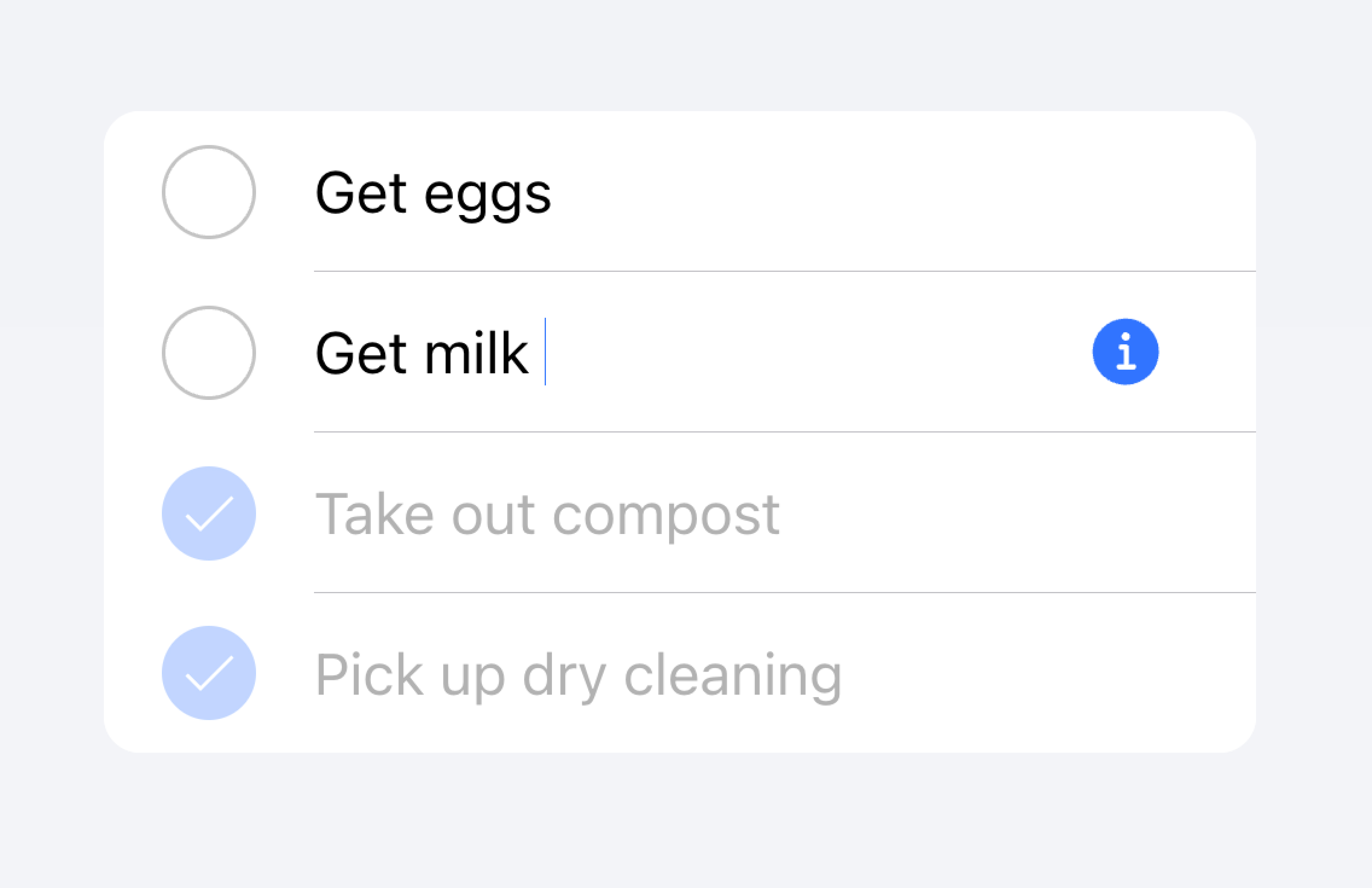
Move additional controls to a submenu accessible from the item.
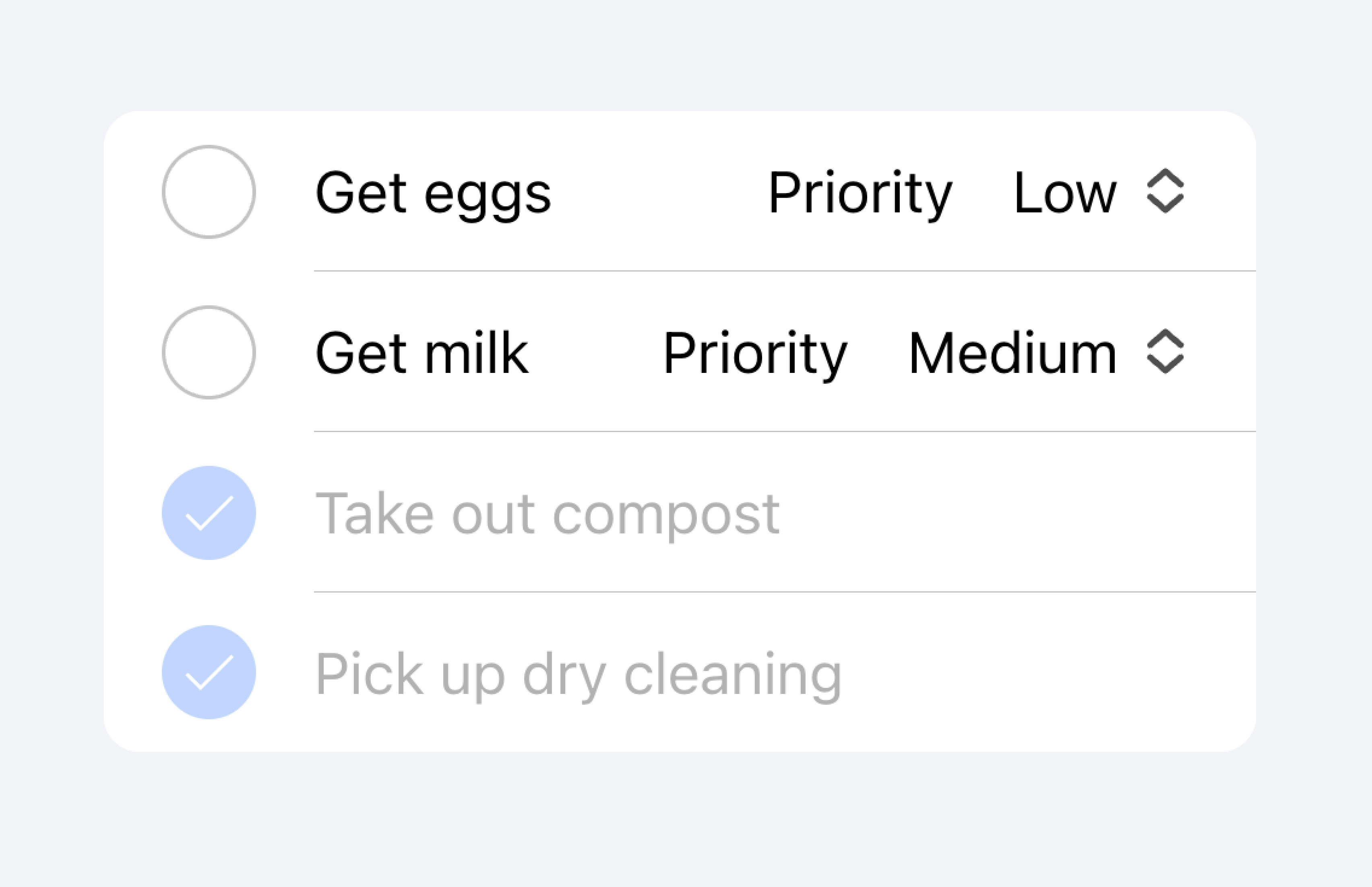
Don't use more than two controls within an item.
In the example below, we are creating a list of to-do tasks. Each item has a checkbox and an input. The checkbox lets the user mark a task as complete, and the input lets the user change the name of the task.
Clickable Items
An item is considered "clickable" if it has an href or button property set. Clickable items have a few visual differences that indicate they can be interacted with. For example, a clickable item receives the ripple effect upon activation in md mode, has a highlight when activated in ios mode, and has a detail arrow by default in ios mode.
Detail Arrows
By default clickable items will display a right arrow icon on ios mode. To hide the right arrow icon on clickable elements, set the detail property to false. To show the right arrow icon on an item that doesn't display it naturally, set the detail property to true.
Item Lines
Items show an inset bottom border by default. The border has padding on the left and does not appear under any content that is slotted in the "start" slot. The lines property can be modified to "full" or "none" which will show a full width border or no border, respectively.
Buttons in Items
Buttons are styled smaller inside of items than when they are outside of them. To make the button size match buttons outside of an item, set the size attribute to "default".
Item Inputs
Theming
Colors
CSS Shadow Parts
CSS Custom Properties
Guidelines
The following guidelines will help ensure your list items are easy to understand and use.
- Items should only be used inside of Lists.
- Items inside of a list should be presented in a consistent format. For example, if your items present decorative icons, the icons should be positioned in the same way between items.
- Items should never render nested interactives. Screen readers are unable to select the correct interactive element when nested interactives are used. For example, avoid placing a button inside of an
ion-itemthat hasbutton="true". - Use content types correctly. The Item component is designed to be a row in a List and should not be used as a general purpose container.
Properties
button
| Description | If true, a button tag will be rendered and the item will be tappable. |
| Attribute | button |
| Type | boolean |
| Default | false |
color
| Description | The color to use from your application's color palette. Default options are: "primary", "secondary", "tertiary", "success", "warning", "danger", "light", "medium", and "dark". For more information on colors, see theming. |
| Attribute | color |
| Type | "danger" | "dark" | "light" | "medium" | "primary" | "secondary" | "success" | "tertiary" | "warning" | string | undefined |
| Default | undefined |
counter (deprecated)
| Description | If true, a character counter will display the ratio of characters used and the total character limit. Only applies when the maxlength property is set on the inner ion-input or ion-textarea.Deprecated — Use the counter property on ion-input or ion-textarea instead. |
| Attribute | counter |
| Type | boolean |
| Default | false |
counterFormatter (deprecated)
| Description | A callback used to format the counter text. By default the counter text is set to "itemLength / maxLength". Deprecated — Use the counterFormatter property on ion-input or ion-textarea instead. |
| Attribute | undefined |
| Type | ((inputLength: number, maxLength: number) => string) | undefined |
| Default | undefined |
detail
| Description | If true, a detail arrow will appear on the item. Defaults to false unless the mode is ios and an href or button property is present. |
| Attribute | detail |
| Type | boolean | undefined |
| Default | undefined |
detailIcon
| Description | The icon to use when detail is set to true. |
| Attribute | detail-icon |
| Type | string |
| Default | chevronForward |
disabled
| Description | If true, the user cannot interact with the item. |
| Attribute | disabled |
| Type | boolean |
| Default | false |
download
| Description | This attribute instructs browsers to download a URL instead of navigating to it, so the user will be prompted to save it as a local file. If the attribute has a value, it is used as the pre-filled file name in the Save prompt (the user can still change the file name if they want). |
| Attribute | download |
| Type | string | undefined |
| Default | undefined |
fill (deprecated)
| Description | The fill for the item. If "solid" the item will have a background. If "outline" the item will be transparent with a border. Only available in md mode.Deprecated — Use the fill property on ion-input or ion-textarea instead. |
| Attribute | fill |
| Type | "outline" | "solid" | undefined |
| Default | undefined |
href
| Description | Contains a URL or a URL fragment that the hyperlink points to. If this property is set, an anchor tag will be rendered. |
| Attribute | href |
| Type | string | undefined |
| Default | undefined |
lines
| Description | How the bottom border should be displayed on the item. |
| Attribute | lines |
| Type | "full" | "inset" | "none" | undefined |
| Default | undefined |
mode
| Description | The mode determines which platform styles to use. This is a virtual property that is set once during initialization and will not update if you change its value after the initial render. |
| Attribute | mode |
| Type | "ios" | "md" |
| Default | undefined |
rel
| Description | Specifies the relationship of the target object to the link object. The value is a space-separated list of link types. |
| Attribute | rel |
| Type | string | undefined |
| Default | undefined |
routerAnimation
| Description | When using a router, it specifies the transition animation when navigating to another page using href. |
| Attribute | undefined |
| Type | ((baseEl: any, opts?: any) => Animation) | undefined |
| Default | undefined |
routerDirection
| Description | When using a router, it specifies the transition direction when navigating to another page using href. |
| Attribute | router-direction |
| Type | "back" | "forward" | "root" |
| Default | 'forward' |
shape
| Description | The shape of the item. If "round" it will have increased border radius. |
| Attribute | shape |
| Type | "round" | undefined |
| Default | undefined |
target
| Description | Specifies where to display the linked URL. Only applies when an href is provided. Special keywords: "_blank", "_self", "_parent", "_top". |
| Attribute | target |
| Type | string | undefined |
| Default | undefined |
type
| Description | The type of the button. Only used when an onclick or button property is present. |
| Attribute | type |
| Type | "button" | "reset" | "submit" |
| Default | 'button' |
Events
No events available for this component.
Methods
No public methods available for this component.
CSS Shadow Parts
| Name | Description |
|---|---|
detail-icon | The chevron icon for the item. Only applies when detail="true". |
native | The native HTML button, anchor or div element that wraps all child elements. |
CSS Custom Properties
| Name | Description |
|---|---|
--background | Background of the item |
--background-activated | Background of the item when pressed. Note: setting this will interfere with the Material Design ripple. |
--background-activated-opacity | Opacity of the item background when pressed |
--background-focused | Background of the item when focused with the tab key |
--background-focused-opacity | Opacity of the item background when focused with the tab key |
--background-hover | Background of the item on hover |
--background-hover-opacity | Opacity of the background of the item on hover |
--border-color | Color of the item border |
--border-radius | Radius of the item border |
--border-style | Style of the item border |
--border-width | Width of the item border |
--color | Color of the item |
--color-activated | Color of the item when pressed |
--color-focused | Color of the item when focused with the tab key |
--color-hover | Color of the item on hover |
--detail-icon-color | Color of the item detail icon |
--detail-icon-font-size | Font size of the item detail icon |
--detail-icon-opacity | Opacity of the item detail icon |
--highlight-color-focused | The color of the highlight on the item when focused. Only applies to inputs and textareas using the legacy form syntax. DEPRECATED: Highlights can be styled on ion-input or ion-textarea when using the modern form syntax. |
--highlight-color-invalid | The color of the highlight on the item when invalid. Only applies to inputs and textareas using the legacy form syntax. DEPRECATED: Highlights can be styled on ion-input or ion-textarea when using the modern form syntax. |
--highlight-color-valid | The color of the highlight on the item when valid. Only applies to inputs and textareas using the legacy form syntax. DEPRECATED: Highlights can be styled on ion-input or ion-textarea when using the modern form syntax. |
--highlight-height | The height of the highlight on the item. Only applies to inputs and textareas using the legacy form syntax. DEPRECATED: Highlights can be styled on ion-input or ion-textarea when using the modern form syntax. |
--inner-border-width | Width of the item inner border |
--inner-box-shadow | Box shadow of the item inner |
--inner-padding-bottom | Bottom padding of the item inner |
--inner-padding-end | Right padding if direction is left-to-right, and left padding if direction is right-to-left of the item inner |
--inner-padding-start | Left padding if direction is left-to-right, and right padding if direction is right-to-left of the item inner |
--inner-padding-top | Top padding of the item inner |
--min-height | Minimum height of the item |
--padding-bottom | Bottom padding of the item |
--padding-end | Right padding if direction is left-to-right, and left padding if direction is right-to-left of the item |
--padding-start | Left padding if direction is left-to-right, and right padding if direction is right-to-left of the item |
--padding-top | Top padding of the item |
--ripple-color | Color of the item ripple effect |
--transition | Transition of the item |
Slots
| Name | Description |
|---|---|
| `` | Content is placed between the named slots if provided without a slot. |
end | Content is placed to the right of the item text in LTR, and to the left in RTL. |
error | Content is placed under the item and displayed when an error is detected. DEPRECATED Use the "errorText" property on ion-input or ion-textarea instead. |
helper | Content is placed under the item and displayed when no error is detected. DEPRECATED Use the "helperText" property on ion-input or ion-textarea instead. |
start | Content is placed to the left of the item text in LTR, and to the right in RTL. |