UIコンポーネント
Ionic アプリは、コンポーネントと呼ばれる高レベルのビルディングブロックで構成されており、アプリの UI を迅速に構築できます。Ionic には、カード、リスト、タブなど、多数のコンポーネントが標準装備されています。基本を理解したら、各コンポーネントとサブコンポーネントの完全なリストについてはAPI Indexを参照してください。
アコーディオンは、情報を整理・グループ化する方法を提供しながら、垂直方向のスペースを減らすために、コンテンツに折りたたみ可能なセクションを提供します。
アクションシートは、アクションを確認またはキャンセルする機能とともに、一連のオプションを表示します。
Alertは、特定のアクションまたはアクションのリストを選択する機能を、ユーザーに提供するための優れた方法です。
Badgeコンポーネントは、通常は数値をユーザーに伝えるための小さなコンポーネントです。
Breadcrumbsは、ユーザーがアプリ内のどこにいるかを示すために使用されるナビゲーションアイテムです。
Buttonを使ってユーザが行動を起こせます。アプリと対話したり、移動したりするのに不可欠な方法です。
カードは重要なコンテンツを表示する優れた方法であり、画像、ボタン、テキストなどを含めることができます。
Checkboxを使用して、択一の決定をする必要があることをユーザーに知らせることができます。
Chipはデータやアクションを表示するためのコンパクトな方法です。
Contentは、アプリと対話してアプリをナビゲートするための典型的な方法です。
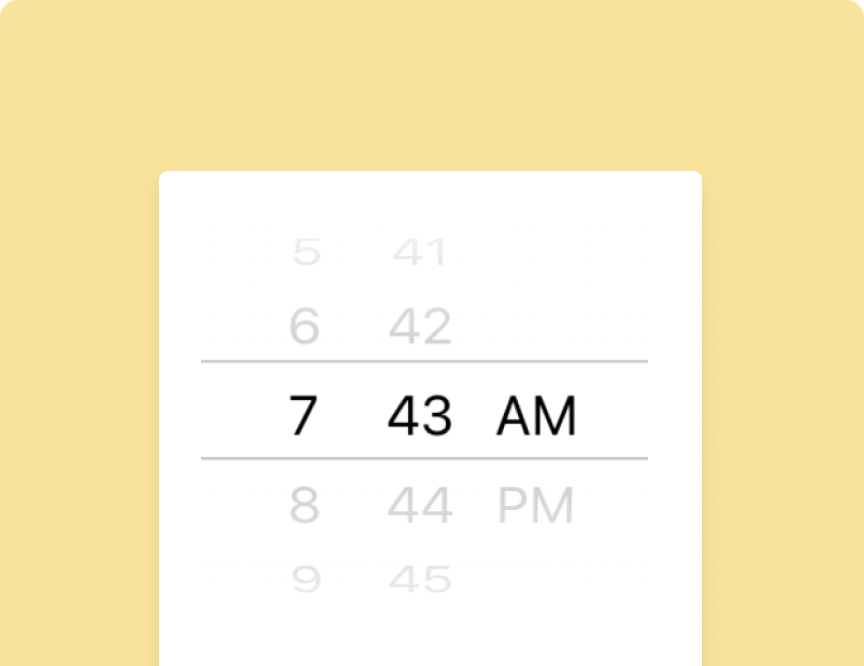
Date & Timeピッカーは、ユーザーが日付と時刻を簡単に選択できるインターフェースを提供するために使用されます。
フローティングアクションボタン(FAB)は、画面上で主要な、または最も一般的なアクションを実行する円形のボタンです。
Gridはカスタムレイアウトを構築するための強力なモバイルファーストシステムです。
Web、iOS、Androidアプリで使用するために美しくデザインされたアイコン。
Infinite scrollは、ユーザーがアプリをスクロールするときに新しいデータを読み込むことができます。
Inputは、ユーザーがアプリにデータを入力する方法を提供します。
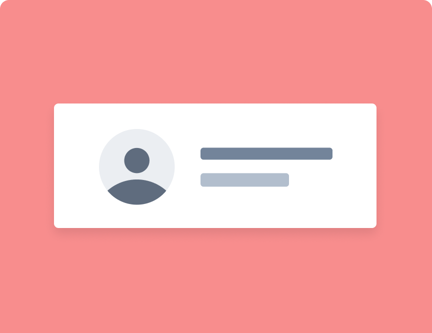
Itemは、テキスト、アイコン、アバター、画像、入力、およびその他のネイティブまたはカスタム要素を含むことができる要素です。 Itemは、スワイプ、削除、並び替え、編集などが可能です。
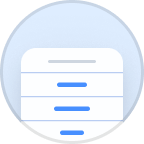
Listは、連絡先リスト、再生リスト、メニューなどの情報の行を表示できます。
アバター、アイコン、画像、サムネイルを含むメディアコンポーネントのコレクションで、視覚的なコンテンツを強化するように設計されています。
Menuは一般的なナビゲーションパターンです。それらは常時画面上に表示することも、必要に応じて表示することもできます。
Modalはは、一時的なUIを表示するために画面内および画面外にスライドするため、ログインページまたはサインアップページによく使用されます。
Navigationは、ユーザーがアプリ内の異なるページ間を移動する方法です。
Popoverは、コンテキストを変えずに情報やオプションを提示する簡単な方法を提供します。
Progress indicatorsは、操作またはアクティビティの進行状況を視覚化します。
Radio inputsはあなたが排他的なオプションのセットを提示することを可能にします。
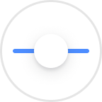
Rangeスライダーは、ユーザーがトラックに沿ってノブをドラッグして値を選択できるようにします。
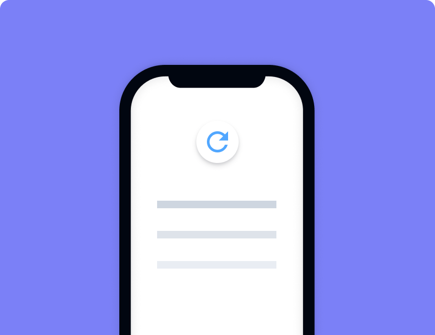
Refresherは、コンテンツコンポーネントにプルツーリフレッシュ機能を提供します。
Reorderを使用すると、ユーザーはドラッグアンドドロップでアイテムのリストを並べ替えることができます。
Routingは現在のpathに基づいてナビゲーションを可能にします。
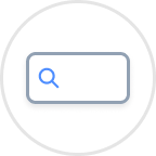
検索バーは、通常ツールバーから、アイテムを検索またはフィルタリングするために使用されます。
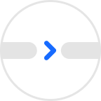
Segmentsは、フィルターまたはViewの切り替えとして使用できる一連の専用ボタンを提供します。
SelectはネイティブのHTML選択に似ていますが、Sortと選択が少し改善されています。
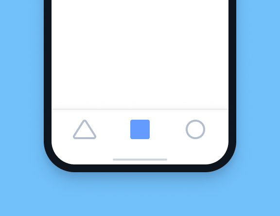
Tabsを使用すると、タブ付きナビゲーション、つまり現代のアプリケーションの標準的なナビゲーションパターンが有効になります。
Toastは、ユーザーの操作を中断することなく、アプリのコンテンツの上に表示される控えめな通知です。
Togglesは択一のInputでありオプションやスイッチによく使われます。
Toolbarは、アプリに関連する情報とアクションを配置するために使用されます。
Typographyは、アプリケーション内のテキストのスタイルを設定したり、色を変更したりするために使用されます。