高度なカスタマイズ
CSS ベースのテーマ設定では、CSS ファイルをロードするか、いくつかの CSS プロパティ値を変更することで、アプリの配色をすばやくカスタマイズできます。
theme-color Meta
メタタグの theme-color は、ブラウザがページや周囲のインターフェイスの表示をカスタマイズするために使用する色を示します。この種類の meta タグはメディアクエリも受け付けることができ、開発者はライトモードとダークモードの両方でテーマカラーを設定することができます。
メタタグ theme-color の content 値には��、有効な CSS Color を含める必要があり、CSS Variables を含めることはできません。
Theme-colorメタは、Web ブラウザまたは PWA として実行するときにインターフェースのテーマを制御し、アプリが Capacitor または Cordova を使用してデプロイされるときには影響しません。ステータスバーの下の領域をカスタマイズしたい場合は、Capacitor Status Bar Pluginを使用することをお勧めします。
以下の例では、iOS 15 でブラウザのインターフェイスをスタイルするために theme-color を使用する方法を示しています。
<meta name="theme-color" media="(prefers-color-scheme: light)" content="#0054e9" />
<meta name="theme-color" media="(prefers-color-scheme: dark)" content="#eb445a" />
| Light Mode | Dark Mode |
|---|---|
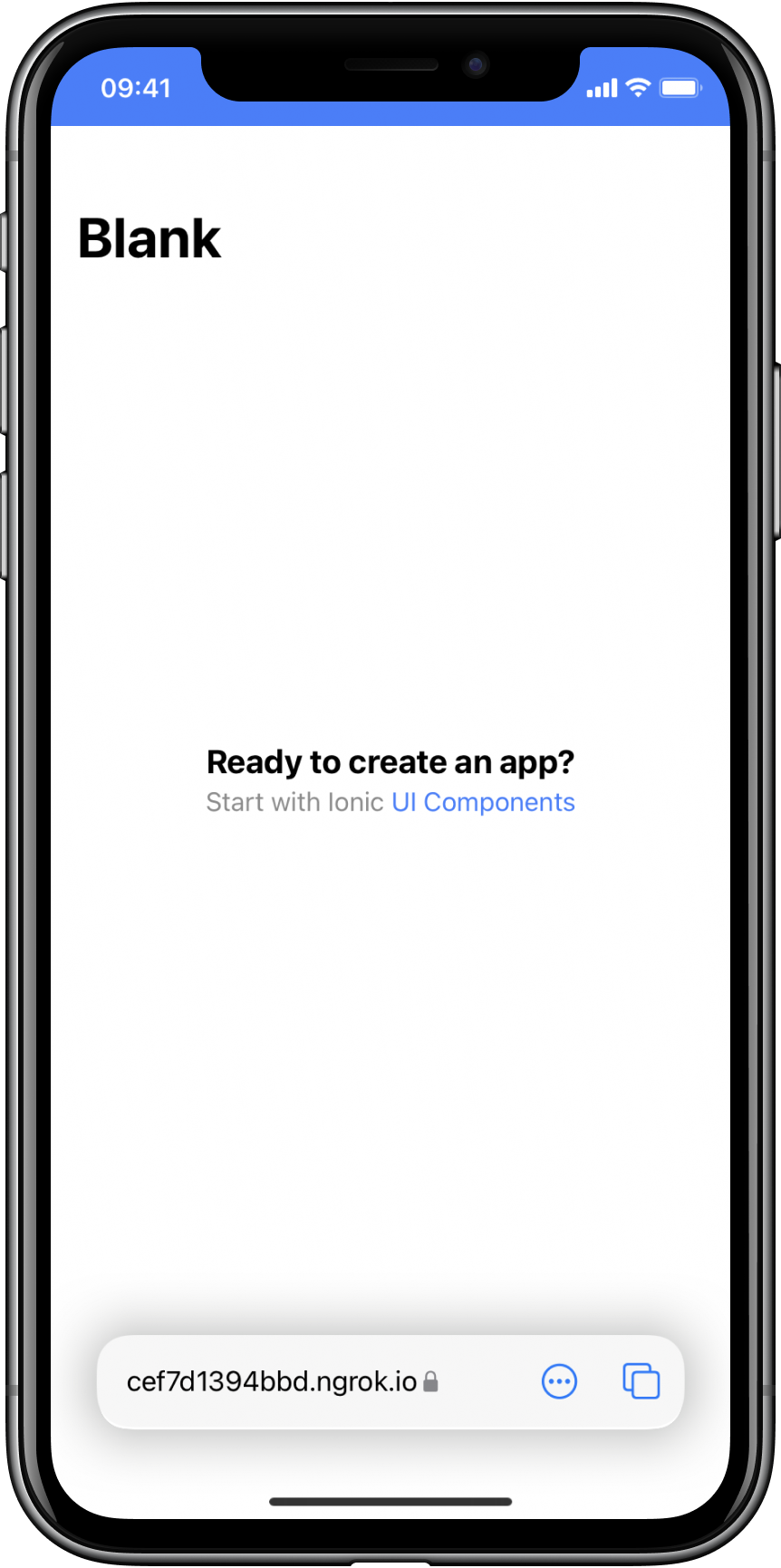 | 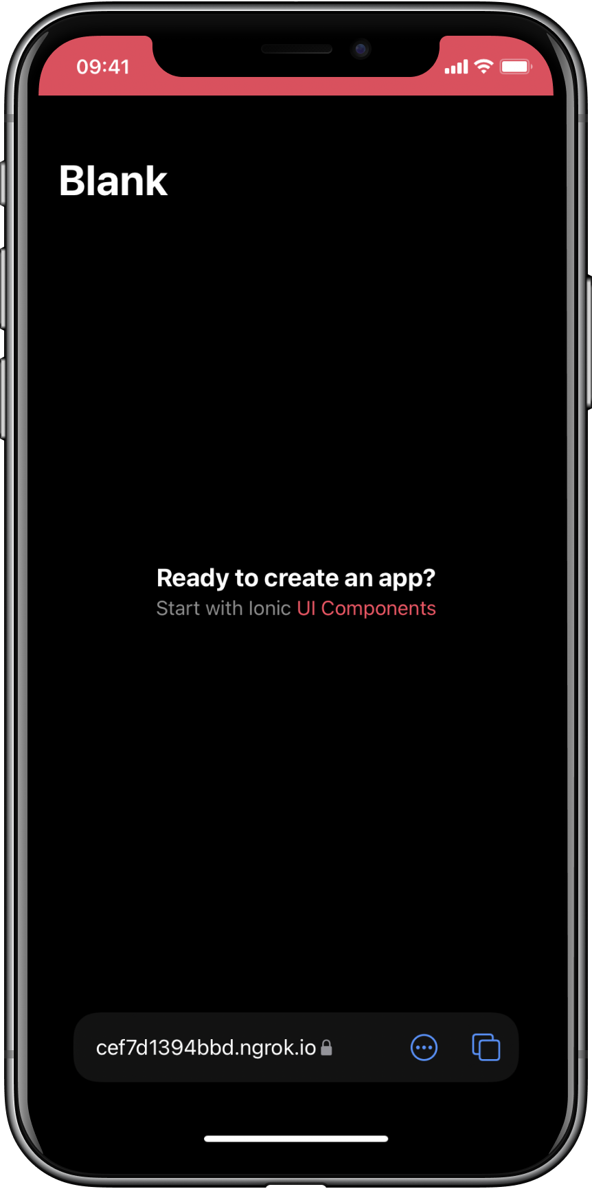 |
macOS Monterey 以降の Safari では、theme-colorメタを使用してツールバーをカスタマイズすることもできます。
iOS 15 と macOS の Safari は自動的に適切なテーマカラーを決定しますが、テーマをより細かく制御したい場合はこの meta タグを追加すると便利です。
ブラウザのインターフェイスに干渉するため、ブラウザが使用しない色の小さなサブセットがあります。例えば、content="red"と設定すると、macOS の Safari では、ツールバーの赤い閉じるボタンと�干渉してしまうため、動作しません。このような状況に遭遇した場合は、色の選択を少し変えてみてください。
ブラウザは manifest.json に theme よりも theme-color メタが存在する場合、それを優先します。
詳しくは、MDN theme-color documentation をご覧ください。
グローバル変数
テーマセクションのアプリケーション変数とステップ変数は、アプリケーションの色を変更するのに便利ですが、しばしば、複数のコンポーネントで使用される変数が必要になることがあります。以下の変数は、コンポーネント間で共有され、グローバルなパディング設定などを変更することができます。
Application Variables
| Name | Description |
|---|---|
--ion-font-family | Font family of the app |
--ion-statusbar-padding | Statusbar padding top of the app |
--ion-safe-area-top | Adjust the safe area inset top of the app |
--ion-safe-area-right | Adjust the safe area inset right of the app |
--ion-safe-area-bottom | Adjust the safe area inset bottom of the app |
--ion-safe-area-left | Adjust the safe area inset left of the app |
--ion-margin | Adjust the margin of the Margin attributes |
--ion-padding | Adjust the padding of the Padding attributes |
--ion-placeholder-opacity | Adjust the opacity of the placeholders used in the input, textarea, searchbar, and select components |
Grid Variables
| Name | Description |
|---|---|
--ion-grid-columns | Number of columns in the grid |
--ion-grid-padding-xs | Padding of the grid for xs breakpoints |
--ion-grid-padding-sm | Padding of the grid for sm breakpoints |
--ion-grid-padding-md | Padding of the grid for md breakpoints |
--ion-grid-padding-lg | Padding of the grid for lg breakpoints |
--ion-grid-padding-xl | Padding of the grid for xl breakpoints |
--ion-grid-column-padding-xs | Padding of the grid columns for xs breakpoints |
--ion-grid-column-padding-sm | Padding of the grid columns for sm breakpoints |
--ion-grid-column-padding-md | Padding of the grid columns for md breakpoints |
--ion-grid-column-padding-lg | Padding of the grid columns for lg breakpoints |
--ion-grid-column-padding-xl | Padding of the grid columns for xl breakpoints |
既知の変数の制限
The Alpha Problem
16 進数カラーのアルファ使用については、まだ完全なブラウザサポートはありません。rgba() 関数は、R, G, B, A (Red, Green, Blue, Alpha) のフォーマットのみ利用可能です。次のコードは、rgba() に受け渡される正しい値と間違った値の例を示しています。
/* These examples use the same color: blueviolet. */
.broken {
  --violet: #8a2be2;

  /* rgba(#8a2be2, .5) */
  color: rgba(var(--violet), 0.5); /* ERROR! Doesn't support hex. */
}

.working {
  --violet-rgb: 138, 43, 226;

  /* rgba(138, 43, 226, .5) */
  color: rgba(var(--violet-rgb), 0.5); /* WORKS! */
}
See the CSS Variables section for more information on how to get and set CSS variables.
Ionic はいくつかのコンポーネントで不透明度(アルファ)を 持つ色を使用します。これが機能するためには、それらのプロパティは RGB フォーマットで提供されなければなりません。末尾にバリエーションがあるプロパティのいずれかを変更する場合、 -rgb で終わる括弧なしのカンマ区切り形式でも提供されることが重要です。以下は、テキストと背景色を変更するための例です。
:root {
  /* These examples use the same color: sienna. */
  --ion-text-color: #a0522d;
  --ion-text-color-rgb: 160, 82, 45;

  /* These examples use the same color: lightsteelblue. */
  --ion-background-color: #b0c4de;
  --ion-background-color-rgb: 176, 196, 222;
}
RGB 形式の色は hex プロパティとまったく同じ色ですが、現在は rgba() で使用できることに注意してください。例えば、--ion-text-color-rgb は以下のように利用できます。
body {
  color: rgba(var(--ion-text-color-rgb), 0.25);
}
Variables in Media Queries
メディアクエリ の CSS 変数は現在サポートされていませんが、この問題を解決するcustom media queries と custom environment variablesを追加するためのオープンドラフトがあります。ただし、現在のサポート状態では、�次の機能は動作しません。
:root {
  --breakpoint: 600px;
}

@media (min-width: var(--breakpoint)) {
  /* Doesn't work :( */
}
CSS カラー変数の変更
Sass の組み込み関数を使用して簡単に色を変更することは可能ですが、現在のところ CSS 変数で設定された色を変更するのはそれほど簡単ではありません。これは、CSS で RGB or HSL チャネルまたは HSL チャネルを分割してそれぞれの値を変更することで実現できますが、複雑で機能が不足しています。
正確に説明します。基本的に、Sass などの CSS プリプロセッサを使用すると、関数を使用して単一の色を操作できます。たとえば、Sass には次のカラーを作成できます:
// Background color, shade, and tint
$background: #0054e9;
$background-shade: mix(#000, $background, 12%);
$background-tint: mix(#fff, $background, 10%);

// Text color, darker and lighter
$text: #444;
$text-darker: darken($text, 15);
$text-lighter: lighten($text, 15);
After running through the Sass compiler, the colors will have the following values:
| Variable | Value |
|---|---|
$background | #0054e9 |
$background-shade | #004acd |
$background-tint | #1a65eb |
$text | #444444 |
$text-darker | #1e1e1e |
$text-lighter | #6a6a6a |
ただし、CSS 変数は実行時に設定でき、より動的であるため、現時点では単純な関数を使用して操作することはできません。
これは通常は問題にはなりませんが、アプリケーションに動的なテーマカラーの設定が必要な場合は問題になります。Ionic では、これが各色にバリエーションがある理由であり、テーマ設定にstepped colorsが必要な理由でもあります。
There are drafts and issues discussing color modification proposals that would make this possible.
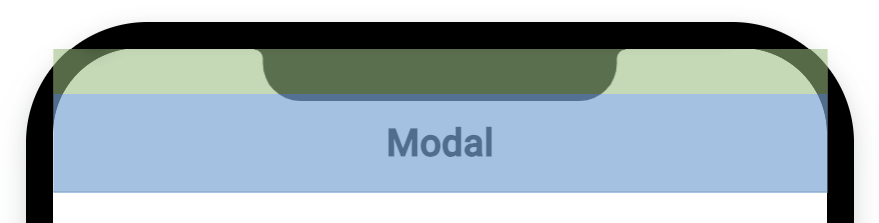
Safe Area Padding
The safe area of a display is the section that is not covered by the device's notch, status bar, or other elements that are part of the device's UI and not the app's. The dimensions of the safe area are different across devices and orientations (portrait or landscape).
For example, below are screenshots of an iPhone 14 Pro Max. The red section is the safe area, and the white sections are places where the app's content would be covered up.
| Portrait | Landscape |
|---|---|
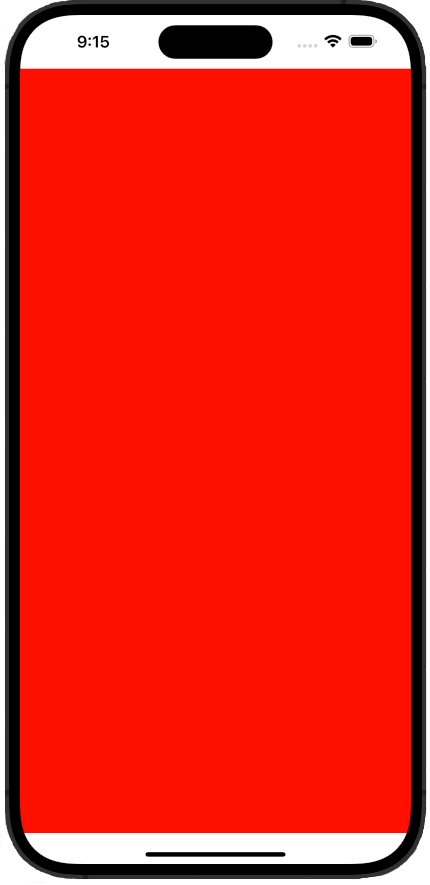 | 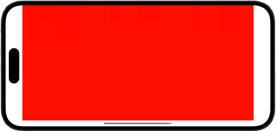 |
To accommodate this, Ionic automatically adds padding to certain components. For example, the first ion-toolbar component placed in an ion-modal will receive padding according to the top edge of the device's safe area. This avoids the device's notch covering up the header text.
This padding can be manually adjusted through CSS using the --ion-safe-area-(dir) variables described in Application Variables. Values can be set for the whole application, or on a per component basis. For example:
html {
  --ion-safe-area-left: 25px;
}

ion-modal {
  --ion-safe-area-top: 0;
}